Web Directions Hover 2022 Day 2 notes
• by • in categories: Culture Amp, web development
These are the live notes I took from Day 2 of the Web Directions Hover 2022 conference for our team internally at Culture Amp.
See also: Web Directions Hover 2022 Day 1 notes.
Adrian Bece: “Effective CSS refactoring”
Permalink to Adrian Bece: “Effective CSS refactoring”CSS is a simple language, which leaves the door open for many antipatterns. Codebases become more and more difficult to maintain. We want to refactor, but we need to consider some important details to make this practical.
Netlify refactored their codebases last year (semantic CSS → Tailwind). This article lists all the forms of unwanted complexity that creep into a CSS codebase.
- Good CSS auditing tool: cssstats.com
- Wallace CLI: can run in CI
Refactoring is best done at quiet times in a codebase that you know will be actively modified going forward. Work with leadership to set aside time for this kind of housekeeping. Do it in a way that doesn’t block feature development. Try to keep tasks small (see: Refactoring Tunnels).
Refactoring strategy (example: legacy card CSS + global CSS):
- Select lowest-scope component (in this case, the card rather than the grid in which it is contained)
- Develop styles for the component in isolation (e.g. develop it in CodePen, or prefix class names for this component)
- Merge & fix issues: Replace the markup and add the new CSS; leave the legacy styles for now. If the new styles clash or are broken by old styles, implement temporary fixes in a separate file, that you will delete later.
- Remove legacy CSS, test & deploy: Consider A/B testing to detect any impact on user experience. Use visual regression tooling if you can.
- Repeat for all components, remove the temporary overrides as you go.
Avoiding the need to refactor: discipline, attention to detail, CSS knowledge, well-bounded components. See cssguidelin.es.
Useful interactive coding challenges: frontendmentor.io
Michael Mladky: “Modern CSS rendering performance”
Permalink to Michael Mladky: “Modern CSS rendering performance”Chrome’s rendering pipeline has 12 steps! contain and content-visibility let us skip steps of this rendering pipeline to improve performance.
- Scripting introduces changes to DOM or Styles.
- Recalculate Styles determines what styles change on what elements as a result.
- Layout calculates the dimensions of elements.
- Hit testing determines the pointer bounds for mouse interactions.
- Paint generates the pixels for all layers.
- Composite merges all the layers into one image.
Elements have:
- border-box: determines the layout dimensions for an element
- visible boundary: determines the area that needs painting
- screen viewport: determines what elements are actually visible
Michael created a testing environment that allowed him to trigger layout and painting.
contain is supported in all the major browsers, and has been supported for awhile in most, but just landed in Safari 15.4.
contain: layout helps us reduce layouting cost. This has the biggest impact (because it also avoids paints). Layout effects in other parts of the DOM will not trigger layout recalculations for children of this element. Element gets its own stacking context, which can introduce bugs if you aren’t expecting it. Performance is not affected by whether elements are visible within the viewport or not.
contain: paint helps to reduce painting cost by not repainting the contents of the element. Crops descendants to the bounds of this element – just like overflow: hidden. Dramatically reduces the render time from changes to those elements – especially when they are offscreen!
contain: size reduces the time it takes to calculate element dimensions. But you need to specify dimensions yourself.
There are also some shorthand values that combine behaviours: contain: content and contain: strict. contain: content usually provides the best combination of performance impact and usability.
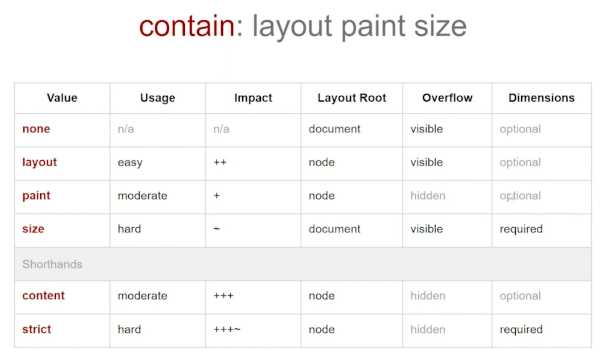
contain property and their characteristicscontent-visibility: auto (Chrome only) lets you skip rendering for elements that are not (yet) in the browser viewport. It even skips CSS property value recalculation for those nodes. You need to specify a static size for these elements (since the browser won’t do the layout to calculate it for you), to avoid scrollbar flickering. This has a dramatic impact on page rendering performance on really large pages, though!
Michael works at a consultancy that does web application performance audits, and helps companies resolve performance bottlenecks like this.
Ben Buchanan: “Real-world CSS custom props”
Permalink to Ben Buchanan: “Real-world CSS custom props”Custom properties are just one example of moving on from abstractions to leverage native web platform features.
Ben works at a company that used many frameworks: Angular, React, Vue, Dash … and whatever comes next. They needed their design system to support even pages that aren’t built with a JavaScript framework!
Already have multiple colour themes, and expect dark mode coming soon.
Sass supports themes, has good error handling, etc. but it’s all at compile time. Updates require you to release and import a new version of your style library.
The team phased out the Sass variables, replacing them with CSS custom props and an HTML API. No one really minded.
They ship all their themes in a single variables.css file, and then they select the theme (usually per-page on the body tag). Custom themes are easy: just declare values for a surprisingly small number of CSS custom properties!
The company considers this a successful “strategic technical investment”. Ben recorded a marketing video about it!
IE11 was fine. They had some bank customers they needed to support, but they made a graceful degradation decision: IE11 doesn’t get themes: they get the default blue theme for everything.
Tradeoff: CSS errors silently, but they wired up stylelint to catch typos in custom property names.
There was some FUD about performance, particularly around calc expressions using custom properties, but they never ran into any bottlenecks in practice.
Some war stories of things that didn’t go so well:
Sass habits: importing your variables at the top of every file like you do in Sass causes the same variable declarations to be output multiple times in your bundle.
Lesson: Make sure you only bundle in a single copy of your variables.
…but this broke their linting, because the linter couldn’t find the variable declarations. Thankfully, an open-source add-on for stylelint solved this for them just in time.
Don’t forget to prefix your variable names, because CSS Custom Properties are a global namespace, and they may clash with other libraries if you’re not careful.
There’s a subtle mindset shift you have to make from using Sass variables (which are actually variables) and “CSS variables” (Custom Properties), which are more like “configuration to create difference”. They ended up building a cascading set of style token variables, then component-specific variables that use those tokens, which they then referenced in their component styles. This is still evolving and is somewhat confusing, especially if you’re used to thinking in Sass terms. CSS Layers may help make all this cleaner.
Kathryn Grayson Nanz: “Ditch the Media Queries: Modern CSS Replacements for Better Responsive Code”
Permalink to Kathryn Grayson Nanz: “Ditch the Media Queries: Modern CSS Replacements for Better Responsive Code”We’ve seen a shift from device-based breakpoints to content-based breakpoints. Now with the necessary features landing in browsers, we want to be moving away from breakpoints entirely to fluid design.
Grid hit full browser support in 2017. Flexbox in 2013. Many developers are unclear on the differences between the two, and assume you should pick one or the other. They’re designed to be complementary, and used together.
Grid can repeat columns or rows automatically, and offers auto-fit to specify column size constraints and have their sizes (and wrapping when necessary) calculated automatically.
Resources:
- A Complete Guide to Grid
- Grid By Example
- frame.scss in the Kendo demo app – a great real-world example of a complex grid to learn from
Flexbox is for laying out items in a single dimension (row or column), with the option to wrap. If you need things to align in two dimensions, you need Grid.
Resources:
- Flexbox Froggy: a game for learning Flexbox!
- FLEX visual cheatsheet
aspect-ratio: Lets you lock an element’s dimensions to an aspect ratio. E.g. Set width and aspect-ratio to auto-calculate height.
min- and max- width and height: Often it will be more convenient to use clamp these days, but these are still useful. Set a “fluid” width then constrain it with a more restrictive/absolute min- and/or max-.
clamp: Set a “base” value, with upper and lower limits. Lets you set responsive limits for values without using breakpoints!
clamp(200px, 50%, 100%) ← Minimum width of 200px, never exceeding 100% of the container width.
calc: Calculate fluid dimensions (e.g. calc(100vw / 3) for one third of viewport width).
min and max: Basically clamp with a single limit.
Responsive units lets the browser do the work for us. Use them whenever you can!
vhandvware percentages of viewport sizes.remandem- combining them for responsive font sizes with limits
Media queries are still useful as an escape hatch for more niche things:
- Accessibility preferences (
prefers-reduced-motion) - Completely changing the layout/styles of a component
- Print stylesheets
Rachel Andrew: “Responsive patterns with subgrid”
Permalink to Rachel Andrew: “Responsive patterns with subgrid”Subgrid is a feature designed to solve the problem you see here: nested grid cells that need to line up with each other.
With basic CSS Grid, only direct children become grid items in a container with display: grid. Therefore nested elements can’t participate in the grid’s layout.
display: grid; grid-template-columns: subgrid will create a nested grid that uses the parent grid’s columns.
Line names (CSS Grid lets you assign names to lines in your grid, so you can use those names to place items) get passed down into subgrids, so you can use them transparently. You can also add subgrid-specific names to your lines, if you need them.
Of course subgrids inherit gaps defined by the parent grid. But you can override this by setting your own gap in the subgrid. [The effect of setting gap: 0 on a subgrid is a bit like negative margins, giving you a “full bleed” effect. Useful in page layouts? 🤔]
Something else Subgrid enables is stretching a top-level grid item to stretch over all of the rows of a wrapping implicit grid (where the number of rows is determined by the content). Put the unknown children inside a subgrid!
Stretching a background to the full page width while keeping the nested content element aligned with the grid is another use case for Subgrid.
Safari Technology Preview supports subgrid and container queries. You can use them together!
@container grid (min-width: 600px) {
  .item {
    display: grid;
    grid-template-columns: subgrid;
  }
}
Stephanie Eckles: “Practical Uses For Container Queries”
Permalink to Stephanie Eckles: “Practical Uses For Container Queries”Container queries = styling elements based on the available space for them.
Start by defining a container: container-type: inline-size is the best supported option right now.
You can then apply styles to descendants of that container – but not the container itself (but this may change with the spec). Polyfill available!
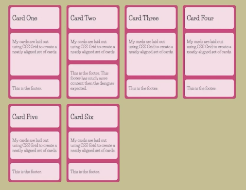
Let’s start with a card example. Recommended: your default styles (which display on unsupported browsers) should accommodate the narrowest width. (I.e. mobile-first.)
Demo: sizing a page with a Flexbox grid. The cards in the grid change their layout type, with the last card (spanning the full width of the bottom row) displaying a different layout than the other cards.
Demo of setting font sizes with clamp and cqi (currently supported as qi in Chrome Canary) container-relative units.
Demo of creating a newsletter signup form with three different CSS Grid layouts based on container size. Grid lets you change the positions of the grid items responsively.
Demo of a pagination component that collapses the clickable page numbers (to “Page x of y”) and the Next/Previous button labels at successively smaller sizes.
You can name your nested containers, to query based on multiple layers of container sizes.
Demo of a nav bar with container queries for the overall bar, and also for the menu inside it.
WCAG “reflow” requirement is for site content to reflow to a single column at 400% zoom (320px equivalent on a 1280px-wide display). Container queries can help with meeting this requirement.
Future features:
- Container queries based on the styles applied to a container (e.g. its
font-size). - Nicer range syntax (
@container (width >= 250px)).
Google Chrome Labs has produced a polyfill for container queries. Only supports px-based queries. No support yet for container-relative units.
Demos here: moderncss.dev/hover22