Email apps on Mac, iPhone and iPad compared
Update Feb 23, 2025: Since I wrote this article, Spark for Mac has gotten steadily more laggy, glitchy and unreliable for me. I have therefore switched back to Apple Mail on all of my devices (Mac, iPhone, iPad and Apple Watch). I’m still really hoping Mimestream gets support for non-Gmail email accounts someday.
I recently shifted to Fastmail after Google announced it was shutting down the free version of G Suite that I’ve used for over a decade. I could have just switched to the paid version, or moved my email, calendar and contacts to a free individual Google account, but this seemed like an opportunity to survey the field and pick the option best suited to my needs and tastes. Fastmail was it: an Australian indie success story that offers an excellent user experience built on a foundation of data privacy and solid engineering. Honestly, I’ve been thinking of switching to Fastmail since Neil Jenkins presented at Web Directions Code 2019 on the custom data compression it does to optimise its web app. The list of alternative email hosts is actually pretty short, with Protonmail and iCloud+ the only others that seemed viable to me.
But I do love a good deep-dive into competing software, so with the time I saved on shopping for email hosts I decided to take a fresh look at email clients for my Apple-ecosystem devices. If you’re in a hurry, feel free to skip to the end to see what I chose. Otherwise, strap in for some obsessive comparison-shopping!
These are the apps that made my shortlist:
-
Apple Mail (Mac, iPhone, iPad, Apple Watch) – AKA Mail.app. Despite a patchy record of quality in the past decade, which has included some almost unusably buggy releases, Apple’s bundled app remains more of a robust all-rounder than almost any competitor (mostly just because of how long it’s been around). The fact that it’s included for free with Apple’s operating systems is probably what makes it so hard for alternatives to make an honest buck, and why a cottage industry of add-ons and extensions exists for it.
Apple Mail on macOS 12 Monterey
-
Canary Mail (Mac, iPhone, iPad, Apple Watch) – Also for Android and Windows. A security- and privacy-forward choice, Canary Mail proves that securing your data needn’t come at the expense of a polished user experience. Despite supporting almost every platform under the sun, Canary Mail ships native apps for all of them.
Canary Mail for macOS
-
MailMate (Mac) – By the numbers, this artisanal Mac-assed Mac app built by a solo developer, positively festooned with low-level power user customisation features advertised as “experimental” or “proof-of-concept” in the web-based manual, should be right up my alley. But it’s really hard to get past the antiquated UI layout; in particular, there’s no widescreen-friendly multi-line message list. Also worrying, the “recommended” version of the app to download has been a sporadically-updated beta for nearly two years now, which makes it hard to bet on as a daily driver, or justify its $50 price tag.
MailMate, using its clever Distortion Mode to obscure my email contents
-
Newton (Mac, iPhone, iPad, Apple Watch) – Also for Android and Windows. Billed as “supercharged emailing”, Newton is a true attempt to rethink the user experience of email to minimise distractions and promote productivity and focus, but in this I’ve found its reach sometimes exceeds its grasp. Newton has had two public brushes with death over the years, but has been under new ownership since early 2020. At $50/year, the full feature set is not cheap but is one I’m happy to pay for if it delivers on its promise.
Newton's typically spartan message viewer
-
Spark (Mac, iPhone, iPad, Apple Watch) – Seemingly the most polished option, with plenty of custom UI touches and integrations with other popular apps in the Apple ecosystem, Spark is from Readdle, purveyors of several attractively-designed productivity apps that I’ve happily paid for over the years before seeing them sherlocked by Apple’s built-in features (Documents, Scanner Pro) or overtaken by a more actively-developed competitor (Calendars). I worry that Spark’s paid features are all for team-based email workflows. Is there really a big enough market for that?
Spark for macOS
And here are a bunch more that I discarded after a first look:
-
Airmail (Mac, iPhone, iPad, Apple Watch) – Ambitiously feature-rich, Airmail tries to be my ideal email client, but the handful of times I’ve trialled it over the years have always left me disappointed. Many of its marquee features (like its “smart inbox”) feel like barely-functional prototypes with little practical value in real-world use. So many reviews praise Airmail for its design, but on macOS it looks to me like a rusting, oddly-arranged pile of features floating in unevenly-spaced UIs. The iOS version seems to have a greater focus on quality than the desktop app, but so much of Airmail’s promise is in how it will sync your configuration across devices, so I find myself judging it as an ecosystem.
-
Chuck (iPhone, iPad) – Chuck is gorgeous, reliable and polished in every detail. It delights me every time I use it, and I recommend it frequently. The only problem is that it’s designed not as a daily email app, but for a specific purpose: inbox cleanup. It’s the forklift I reach for whenever my email gets a little out of hand, and I need to process a month or more of inbox items all at once to catch up. For that task, it is second to none! And though it’s resonably fully-featured, I don’t want to use it every day as my primary means of processing incoming email one by one. Some of the ergonomics are just wrong for this use case (e.g. there is no way to archive the current message and view the next with a single tap). Chuck is such a lovely app, I wish I had a reason to spend money on the Pro version, but for the once or twice a year I need to clean out my overflowing inboxes, the free version offers all I need.
-
Edison Mail (Mac, iPhone, iPad) – Also for Android, Edison’s only standout feature is that it’s free to use. Edison makes its money mining your email headers for e-commerce trend data that it aggregates and sells in the form of market research. Unfortunately this app that sells itself as “the fastest email app available” on its website feels sluggish to use, in part due to gratuitous animations (right-click menus don’t need to bounce open), and while its feature set is surprisingly deep and flexible, its user interface design isn’t.
-
Hey (Mac, iPhone, iPad) – Also for Android, Windows and Linux. The audacious reinvention of email from the server up is tempting, and I may yet circle back to this one. I was honestly put off by how big of a departure this service is: to use it, you must adopt Hey as not just your email client, but your email server. And the glimpse we all got into Basecamp’s company culture last year makes me think twice about being their customer, let alone entrusting them with all my email.
-
Mailspring (Mac) – Also for Windows and Linux. Open source and cross-platform desktop-only mail app built on web technology (Electron). Looks a little half-baked at a glance, and releases seem to have slowed down significantly in 2021. The community around it seems to be much more focused on Linux than on macOS. Though it finally upgraded in February 2022 to a version of Electron that supports Apple Silicon natively, two months later the project has yet to release a download for M1 Macs!
-
Missive (Mac, iPhone, iPad) – Also for Android, Windows, and the Web. Looks attractively designed at a glance, but seems designed around team-based email marketing and customer relationship management (CRM) use cases that aren’t really relevant for me as an individual user. Not for me.
-
Polymail (Mac, iPhone, iPad) – Like Missive, seems designed for team-based business/marketing/sales email workflows. For $10/month, I want something built for users like me.
-
Postbox (Mac) – Also for Windows. A commercial evolution of Mozilla Thunderbird. Its UI looks like a modern desktop app at first glance, but it has that clunky not-quite-native feel of Mozilla apps that bothers me. While something like Newton also feels extremely non-native, at least its novel design justifies this somewhat. Postbox is aggressively “normal”, but without the benefits of native UI. Attractively designed and feature-rich, its feature set sadly left me cold.
-
Spike (Mac, iPhone, iPad) – Also for Android, Windows, and the Web, Spike is the answer to the question, “Why can’t email be more like Slack?” I’m honestly impressed by how well Spike succeeds in turning email into a chat app experience akin to iMessage. Unfortunately, because they support every platform under the sun, the app feels native to none of them. Not only does the user experience feel completely foreign on the Mac, but it’s completely uncustomisable.
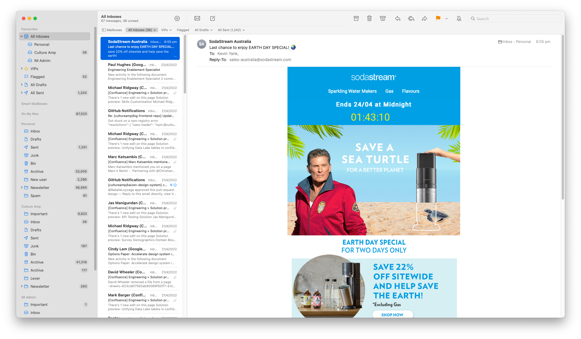
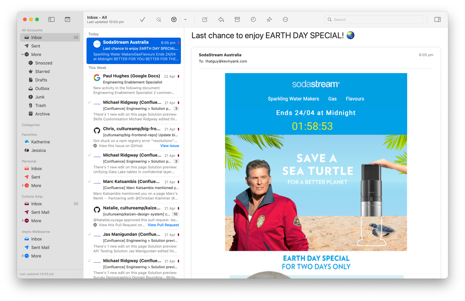
Before we dive into the details, an honourable mention: Mimestream. While not actually an email app (it only works with Google’s email services) it would be my pick of macOS email clients if I could still use it. While it’s still young (in public beta with a price tag yet to be announced) I enjoyed six months with it before my switch to Fastmail, and it made me smile daily with a tasteful-but-native-feeling design, strong keyboard support, and a growing suite of power-user features. I really wish it would support IMAP. If you’re still on Google for your email and you haven’t tried Mimestream, do yourself a favour!
Oh, and you might wonder why I don’t just use Fastmail’s own apps! I certainly applaud Fastmail for shipping well-made, full-featured mobile apps, but the reality is they are merely very nice wrappers for their (also excellent) web app experience. If you live happily in Gmail’s web app, then Fastmail’s equivalent is probably just what you’re looking for. But I’m after a native app that runs as a first-class citizen on macOS, and leverages the native UI and system integration features of iOS and iPadOS. I do keep the Fastmail app installed on my mobile devices, but only as a convenient way to access the service’s account admin screens when I need to.
Going deep on the things that matter (to me)
Permalink to Going deep on the things that matter (to me)While not quite the UI design playground that 3rd party Twitter apps were at their peak (TweetBot is still a steal at twice the price, by the way), email is a stable and open enough platform that there continues to be a steady stream of attempts to reinvent it.
Different people also have very different needs for their email: for some it remains the lifeblood of their professional lives; for others, it’s a relic of a bygone age used only to retrieve lost passwords to their social media and Slack accounts.
The best email client for me might be a terrible fit for your needs, or just your personal tastes. There’s also so many options out there, with so many subtle differences between them, that I need to lay out the pros and cons for myself to make a rational decision!
I’ve therefore spent the past two months juggling the five options on my shortlist, to get a good feel for how they compare beyond first impressions. In the sections that follow, I’ll lay out the elements that make a winning email client for me personally, and describe how the contenders stack up for each.
My email inbox is a noisy place, even after I’ve configured filters to send all my newsletter subscriptions to Feedbin. The less time I spend there, the better.
Both on iOS and macOS, the thing I do most is archive messages in my inbox, rapid-fire, often without reading them beyond the sender and subject, occasionally with a quick peek at the contents first. If there’s an email that I need to reply to or do something about, I’ll still get it out of my inbox as soon as possible. I’ll either compose a quick reply, or (more often) send a copy of the email to my task manager (currently Things), where I can manage it along with my other things to do later.
My ideal mail client will make each of those actions (and especially Archive) a one-step operation – something I can do effortlessly from muscle-memory. Ideally, it’s delightful in a way that doesn’t slow me down.
iPhone apps discovered years ago that swiping messages to dismiss them from your inbox provides the optimal blend of dopamine-charged delight and efficiency, so it’s no surprise that every app in my shortlist supports this. Not all swipes are created equal, however!
The most common swipe action design, which Apple built into iOS, lets you swipe a short distance to reveal buttons for one or more actions and then tap one, or swipe all the way across the list to trigger the first action button with a single gesture. Apple Mail and Canary Mail both work this way, with Apple Mail offering strangely limited customisation options for the swipe actions, and Canary Mail offering more flexibility in its available actions and their assigned positions.
Newton and Spark both implement a superior (in my opinion) custom variant of swipe actions, which does away with the short swipe to reveal a set of buttons and instead maps both short and long swipe gestures to actions. Both apps let you assign actions to short and long swipes to the left or right, with a total of four “swipable” actions, which is plenty for my needs. I find the short swipe gesture in particular to be a really nice way to process email quickly, less tiring than repeatedly long-swiping a large number of emails. Of the two, Spark outshines Newton by offering “Save to” actions for all of its 3rd party app integrations as available swipe actions (e.g. “To Things”).
The ability to send a message straight to my task manager from the message list is pretty compelling, but I want to turn an email into a task most often after reading it. So that brings us to the other mode of triage I’m interested in on mobile apps: the message viewer. Often after making an initial quick processing pass from the message list, I’ll actually read the remaining emails and want to take action from that reading view. An easy-to-tap Archive action is essential, here, and happily all the apps offer this. Most of the apps also offer a way to undo this kind of action if you perform it by accident (either with a button or shake-to-undo), but I couldn’t find one in Canary Mail. Spark edges out the competition here too by offering a fully-customisable toolbar (although curiously, “Save to” actions like creating a to-do item in Things cannot be added as they can for swipe actions).
Triggering other actions, such as integrations with apps like Things (or OmniFocus, or Todoist) or Notes (or Evernote or Bear), is a little more hit-and-miss. Worst of the bunch, Apple Mail requires you to select some text, then find the “Share…” option on the second page of the pop-up menu. Only slightly better, Canary Mail hides the Share option under a “more” button at the bottom of each message (requiring you to scroll and then tap twice before you can select the app). Both Newton and Spark’s “more” buttons are easy to reach at the top of each message, with supported integrations immediately available to select from the pop-up sheet. Spark’s “more” button on the bottom toolbar also lets you share the entire thread, once again giving it a slight edge over the competition.
On the Desktop, rapid triage of the message list while being able to pause and view emails of interest is pretty much a given, but Apple Mail has for many versions had a bothersome glitch that somewhat interferes with this. When working quickly through an inbox, it will sometimes forget which emails have already been queued for archiving and will suddenly display them in the list again until the background sync with the server catches up. This issue is mostly cosmetic, but it’s annoying enough to keep me looking for alternatives.
For maximum ease and efficiency, a single-key shortcut to archive emails is what I’m after on the Mac. Out of the box, Apple Mail’s Archive shortcut is Ctrl-Cmd-A (^⌘A), which is a tiring claw to form over an extended triage session. macOS lets you override this, but only with other modifier-key combinations; thankfully, I was able to use Keyboard Maestro to set up a single-key shortcut (e.g. the Delete key). Newton’s excellent keyboard shortcuts are inspired by Gmail (e.g. E to archive), as are Canary Mail’s and MailMate’s, both of which also support customization of these. Spark’s shortcuts are fully configurable, and include presets based on Apple Mail or Gmail. One nitpick: Spark on Mac still displays a “swipe” animation when archiving message threads with the keyboard, which gets a little slow and stuttery in a large message list.
As for triggering app integrations I use during triage, like creating a task in Things based on an email, apps like these are designed to pull message details from Apple Mail with a system-global keyboard shortcut, so that’s generally the smoothest option. Spark and MailMate are close seconds with the ability to configure custom keyboard shortcuts to trigger their built-in app integrations. Canary’s Share action is hidden behind two mouse-clicks of a menu buried at the bottom of each message (often requiring you to scroll first). Newton’s integrations, besides being similarly hidden away, do not support some apps that are supported in the mobile version – among them Things!
Rapid triage score
Permalink to Rapid triage score- Apple Mail: Good
- Canary Mail: OK
- MailMate: Excellent
- Newton: OK
- Spark: Excellent
While I’ll glance at email on the go, I do most of my email (especially that daily-ish triage to zero) on my Mac. As a coder, the keyboard is my highest-bandwidth means of interacting with my Mac. Reaching for the mouse or trackpad is something I prefer to do by exception; for everything I do frequently, I want to do it without my hands leaving the keyboard. The most important of these workflows I covered in the previous section on rapid triage, but there are others.
Outside of triage, my most common workflow is to search for an email (which may be in my inbox or my archive), select the one I want from the search results, and then scroll through the email as needed to find the information I’m after. If I could do all that (and return to the inbox when I was done) without using a mouse, I’d be in heaven, but surprisingly none of the apps on my shortlist permit this.
Getting to the search field and performing a search is certainly doable in all these apps, but Newton is the only app that comes close to letting me browse the search results and scroll through selected message threads without using my mouse. Indeed, Newton comes very close on this, but its default search results don’t include results from all folders until you select a specific account to search – which can only be done with the mouse. Like so many things I’ve found in Newton, I love the keyboard-optimised user experience they’re shooting for, but in practice there are too many unhandled edge cases for me to rely on it.
If a full keyboard-optimised search-and-read workflow isn’t on offer, I’ll settle for keyboard scrolling. Whether I’m browsing search results or triaging my inbox, I will often find an email thread that I want to read (or just skim), and I want to do that without losing my keyboard focus in the message list. If you’re a 25-year email veteran like me, you might know there is a longstanding convention that the Spacebar pages through displayed email threads without losing focus on the message list. Apple Mail and MailMate both support this superpower, and my fondness/nostalgia for this makes me want to choose one of these apps even if there’s a better choice for my needs in every other respect.
Canary Mail does quite poorly on this test. I was able to get a displayed message to scroll using the page up and down keys (but not the arrow keys) if I hit Tab twice to move keyboard focus from the message list through one invisible focus stop and into another. Once in that keyboard-scrollable state, I’d expect Shift-Tab twice to return me to the message list, but instead I have to tab back through every toolbar button in the app’s toolbar on my way there. With “focus traps” like this lying around, it’s clear that keyboard navigability is not a priority for the Canary Mail team.
As for Spark, I was all ready to damn it with the faint praise that it does support spacebar-scrolling, but only if you tab to the message pane first. But it seems that someone at Readdle finally got around to implementing the feature request I sent them way back in 2017! Spark will indeed page up and down the currently-displayed message thread from the message list using Spacebar and Shift-Spacebar, respectively! It doesn’t let you move between email threads this way, but that’s a relatively small gripe since you can do this with the arrow keys. That said, I’d be remiss not to point out that Spark also has some Canary-Mail-like keyboard focus traps in its UI if you try to get around it with the Tab key.
Keyboard navigation score
Permalink to Keyboard navigation score- Apple Mail: Good
- Canary Mail: Bad
- MailMate: Good
- Newton: OK
- Spark: OK
One of the most attractive features of the Apple ecosystem is how well apps link together to create rich workflows. A great Mac or iPhone app is not an island, but includes integrations with other popular apps, and hooks into which other apps can integrate.
The main integration I look for in my email client is the ability to turn an email message or thread into an action in my task manager, Things (and previously, OmniFocus). In the section on rapid triage I covered the differences in how these integrations are triggered; but beyond how easy they are to invoke, the quality of the integrations themselves vary a great deal.
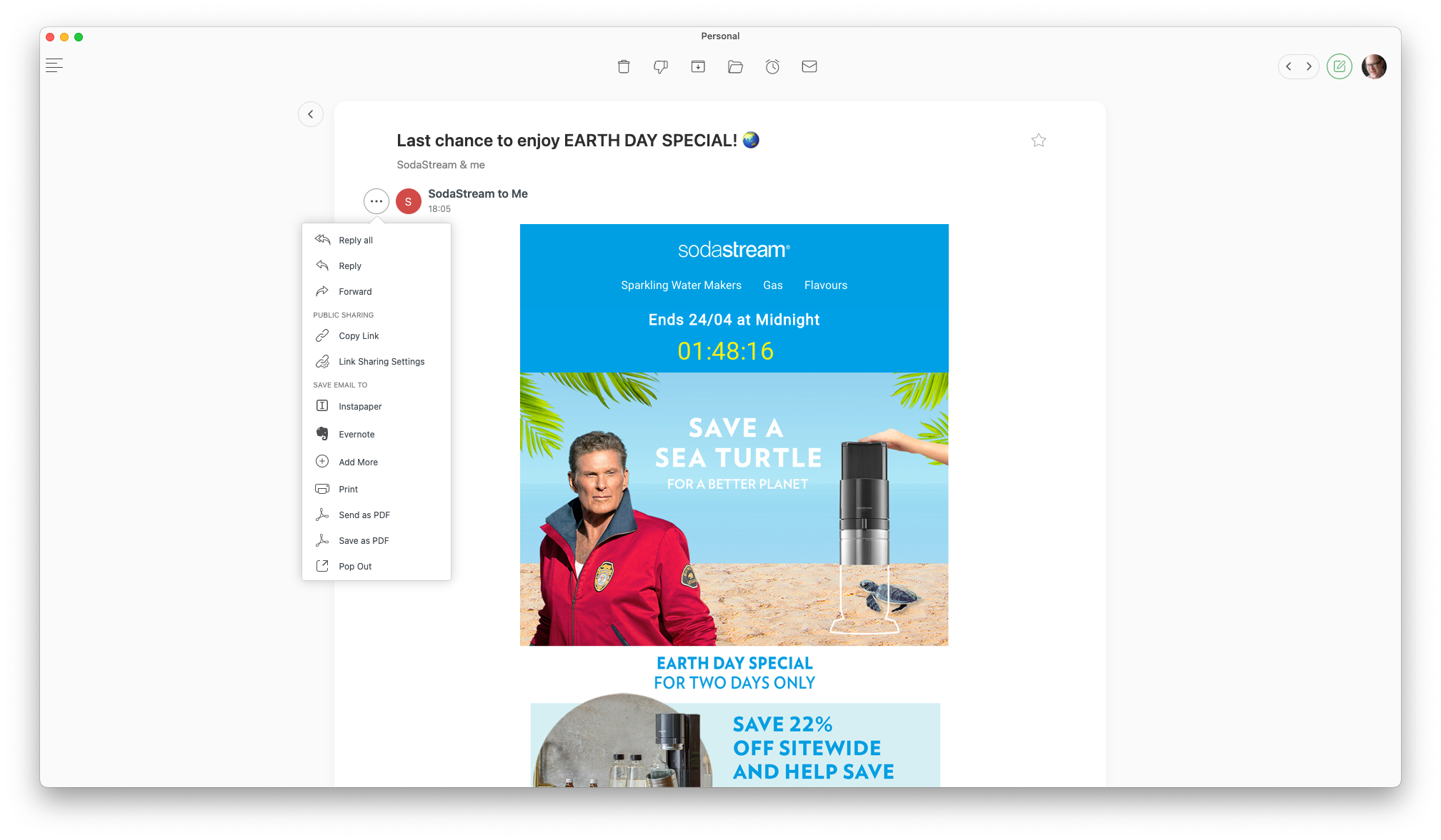
More than just sending the body of a message into Things as a note attached to a task, the best integrations include a link back to the message from the task. Clicking that link in Things should open the original email in my email client again, even if I’ve since filed the message away into my Archive folder. I made a video about this way back in 2013, and I still want this feature today. Not all email apps support it, or support it well.
Canary Mail, Newton, and Spark all share emails including a custom URL scheme that works with the iPhone, iPad, and Mac versions of these apps (canary:, newton:, and spark-mail: respectively). Apple Mail similarly supports message: URLs that apps like Things can create for you when clipping an email. If you create a task from an email on your iPhone, you can later follow that link on your Mac and have the email open in the Mac version of the app. But since these links are app-specific, they will stop working if you switch to another email app in the future. You’re also locked into using the same email app on all your devices if you want these links to work everywhere.
It would be nice if all these apps could agree on a single standard for “open email” URLs, and have the operating system open your preferred email app when you click such a link. In fact, this is indeed possible on the Mac: MailMate supports the same message: link format as Apple Mail, and it will take over the opening of these links on your Mac when you choose it as your default email app. Although I’ve been unable to find documentation to confirm this, I can only assume that Apple does not permit the same overriding of message: link handling on iOS and iPadOS; otherwise, all these other apps wouldn’t have had to invent their own custom URL schemes.
Back-links aside, let’s look at how these app integrations stack up.
Out of the box, Apple Mail leans heavily on drag-and-drop for its integrations. To create a task referencing an email in Things, drag and drop the message from Apple Mail into Things. This mostly works, but is hard to discover and not especially quick. On Mac, apps like Things and OmniFocus let you set up a global “quick entry” keyboard shortcut that will capture the selected email, and give you the opportunity to fill in task details like a due date using the destination app’s interface. On iPhone and iPad this isn’t possible, so apps offer more cumbersome solutions like “Email to Things”, a unique email address to which you forward messages and have them appear in your Things inbox with a back-link a few moments later.
One of the main ways 3rd party email apps seek to compete with Apple Mail is by offering smoother integrations, and they each have their own take:
Canary Mail leans on the operating system’s Share framework. It sends the email to your selected app as a block of plain text: the email’s subject line, the first few lines of the email body, and a back-link to open the email in Canary, all of which land in the “Notes” field of a new task in Things, for example. It isn’t flashy, but it works, and it lets you fill in the rest of a task (e.g. the task name, project and due date) using the destination app’s own user interface.
Newton aims to be a little smarter, providing its own custom support for common apps like Things, but doesn’t go far enough in my view. Sending a message to Things in Newton switches to Things and silently drops a new task in your Inbox. The advantage of this is that Newton can take more control over the format of the created task: it uses the email subject as the task name, and the message body in the task notes, along with the back-link to Newton. The problem is, Things probably isn’t showing your Inbox when it opens, so the silently-created task may not be immediately visible to you. If you can learn to trust that it gets created, and you don’t mind tracking down the task to fill in additional details like a due date separately, this may be fine, but personally I don’t think the pros of Newton’s approach outweigh the cons. Adding to the friction here, Newton has an annoying habit of reloading the message view and resetting the scroll position when you switch back to it. This happens after just long enough of a delay that I’m usually halfway through my next action, and it derails me every time.
Spark takes a similar approach to Newton but goes much farther in polishing the experience. It likewise has its own custom-built support for common apps like Things, but before creating the task it pops up its own UI that lets you confirm and adjust the task details: its title (the subject by default), the format of the notes (the text of the email followed by a back-link to it in Spark, or just the back-link), and optionally a date for the task. These integrations attempt to provide useful defaults and configurable fields that match the conventions of the receiving app, but they don’t always succeed. Having used both Things and OmniFocus extensively, for example, I can say that wanting to specify a start/due time along with a date is rare, but Spark requires you to set one.
For my money, MailMate comes out on top here. Its integrations are custom-built, but rather than providing their own UIs (like Spark) or no UI at all (like Newton), they trigger the receiving app’s UI for task creation. The resulting experience is just as good as the bespoke support that apps tend to provide for Apple Mail, without relying on each of those apps to maintain their own support for MailMate. This seems to be something that Spark and Newton could choose to do both on Mac and iOS/iPadOS, but for whatever reason they don’t.
Deep integrations score
Permalink to Deep integrations score- Apple Mail: Good
- Canary Mail: OK
- MailMate: Excellent
- Newton: Bad
- Spark: Good
Beauty is subjective, but I use macOS, iOS and iPadOS because I enjoy their look and feel – and those of the best apps for these platforms. Of course, apps frequently diverge from Apple’s guidelines to push the boundaries of modern UI design. That’s all great, as long as that boundary-pushing UI remains connected to the core frameworks and foundations that power the basic features of the operating system.
What happens when you select a word in an email and right-click it on macOS? If it’s a native text field, you can choose options to look up the word in a dictionary, or translate it to another language, or even invoke a system service to send the text to another app. If the app isn’t native to the operating system, if it’s using its own custom implementation of UI elements like text fields, then you lose all those facilities except the ones the developer has decided are worth re-creating.
I’m a power user of my operating systems, and I want apps that build on those foundational features, not sacrifice them on the altar of novel design or, more often, cross-platform compatibility.
Apple Mail deserves a lot of credit for not looking its age. While the app’s technical roots are deeply connected to the operating system it ships with, Apple has continued to refresh it each year, keeping it in step with modern UI design trends. While it lacks a little of the eye candy of some alternatives, and appears a little cluttered on Mac and a little empty on iPhone and iPad, as the one-size-fits-all offering that ships with the operating system I’m amazed at how good it looks and feels (and even sounds!).
Canary Mail takes Apple Mail’s native look-and-feel, removes a little of the clutter, and adds some welcome embellishments. My favourite little touch is the option to specify a colour for each of your accounts. This colour is used for the account’s icons in the folder list, and in multi-account message lists like the unified inbox, a little rectangular colour chip appears next to each message so you can eyeball which emails are work-related or personal, for example. Speaking of the message list, I also love the option to see avatars for senders. It’s way nicer to recognise senders by their photo or company logo – this really brings the email experience to life for me. Finally, Canary has a killer “why didn’t anyone think of this sooner” feature that I’m going to call “message action links”, because as far as I can tell it’s completely undocumented and therefore unnamed! On many messages, Canary Mail surfaces the primary action link (Open Card in Trello, View Build, View Issue, View Pull Request, etc.) and displays it right in the message list, so you can click or tap it without even opening the email! This feature is a game-changer, and while I’m impressed by how many actions it already detects, I’d love to see the team lean into this more: let me submit my own sample emails that I’d like to see supported, or even provide a configuration UI to let me configure these myself.
It’s not all good news with Canary Mail, though. As I’ve mentioned above, the buttons to act on individual messages are inconveniently placed at the bottom of the message (often out of sight until you remember to scroll down). On iPhone and iPad, some of the features have been tucked in some strange places: favourite contacts that live in the sidebar on Mac form an alternative view of the inbox that you need to toggle on, and there’s a “Dashboard” screen that seems to serve as a home for UI elements that didn’t fit anywhere else (read receipts and “top contacts”). Lastly, a strange issue I’ve noticed on my Mac is that when the application window is on my external display, all of the icons (including those in the sidebar, the toolbar, and even the user avatars I love so much) seem rendered at low resolution, with distracting nearest-neighbour aliasing that makes the pixel art of the icons especially look bad. The Canary Mail team insists that the app’s UI is macOS-native, but I notice that the app doesn’t display visible scrollbars even though I have my system preferences configured to display them “always”, which seems like a telltale sign there is some kind of non-native UI framework at play here. In any case, I’ve reported the pixelated icons as a bug, and hope this can be fixed.
MailMate, unapologetically, looks like an email app from 15 years ago. Its UI is certainly “platform native”, but it could hardly be called beautiful. It seems stuck in the past, both in macOS UI conventions and in those of email apps in general. In particular, we’ve known for more than a decade that a table view with one row per message was a poor fit for widescreen monitors, either wasting space above the message preview or being too cramped alongside it. The most practical setup I’ve found is to hide the sidebar containing the mailbox list entirely, and just use MailMate split half-and-half with the left side devoted to the message list and the right side for the message viewer. The Cmd-T (⌘T) shortcut to go to a mailbox by typing its name is a useful way to get around without the sidebar. While this makes the app usable for me, MailMate’s lack of a modern, multi-line message list nevertheless makes it feel like a relic out of the past.
At the opposite end of the spectrum, Newton doesn’t feel platform-native at all, especially on Mac, where its window is designed as an open canvas in which UI elements (all of them custom-designed) seem to float. Some of this “blank canvas” approach creates space for features and interactions that aren’t possible in more conventional UIs. For example, on iPhone you can swipe across an email in the message list to select the “Archive” action, then from there swipe down the message list to apply this action to multiple emails in a single gesture. Almost invariably these novel affordances turn out to be half-baked, however: the multi-swipe gesture doesn’t scroll the message list when you get to the top or bottom of the screen, so you can only apply it to a screen’s worth of messages at a time, which isn’t very useful in practice. I wouldn’t mind so much if these often-impractical novelties came for free, but that isn’t so. Select and right-click some text in an email, and the pop-up menu that appears lacks most of the usual facilities. Newton has re-implemented the “Search with Google” item (although it does not reflect the preferred search engine you may have configured in Safari) and a Copy item (which is strangely disabled when the window is not frontmost), but that’s it: the only other menu options are the application integrations you have enabled in Newton. No “Look up”, no “Translate”, no “Share”, “Speech” or “Services”.
On iPhone and iPad, Newton’s UI tends to be a little more “system native” (possibly because it’s built on web technology, and Apple requires apps to use its own native browser engine for web views). But this is offset by a widespread issue of screens taking a long time to load (with a web-style loading spinner appearing for several seconds on a blank screen just to open an email displayed in my inbox!), and then often disappearing and reloading in place, losing your scroll position in the process. This reloading happens mostly (but not only) when you switch away from and back to the app, and it creates a death-by-a-thousand-cuts sort of frustration. At the risk of repeating myself, I’m willing to give a non-native UI a fair shot if the benefits of that novelty outweigh those of native UI, but while Newton is full of exciting ideas, none of them are sufficiently well implemented to avoid causing frequent friction.
Lastly, let’s consider Spark. Readdle is known for pushing the boundaries of Apple’s platforms by building custom UI using native APIs. Its apps often look like a glimpse at the future of Apple’s platforms, and this capability is very much on display in Spark. The app is bright, bold and colourful in ways that Apple’s current design style avoids. It’s opinionated, but customisable in the details with optional account colour-coding for messages, and optional sender avatars both in the message list and in message headers, and configurable toolbars (sadly not on Mac, though). It also leverages new operating system features quicker and more fully than its competitors. For example, Spark is the only app on my shortlist that displays avatar icons for notifications (with a small Spark icon overlay) rather its own icon, just like chat apps like Slack and Apple’s own Messages. Though sadly not yet implemented on the Mac version of Spark, this makes emails much more recognisable at a glance in Notification Centre, not just on my phone but also on my Apple Watch! These little quality-of-life touches in Spark really add up.
Not every UI idea that Spark brings to the table is a winner, though. In some places it feels over-designed. It does this weird thing, for example, where unread emails are indicated by a filled blue circle in the message list, but if you read an email and then mark it as unread, this is indicated by a hollow blue circle. Having two different “unread” indicators is just distracting and inconsistent. It’s also confusing, because these indicators are not explained in the documentation. They don’t even sync across devices: mark a message as unread on your Mac, then refresh your inbox on your iPhone; the unread state is displayed on iPhone with the filled circle indicator. As far as I can tell, the hollow circle means “marked unread manually on this device”, which seems like a feature nobody needs.
Spark’s marquee feature is the Smart Inbox, and while it looks gorgeous and makes for attractive App Store screenshots, I find it impossible to build a workflow around. Rather than a single message list, it shows your inbox in a configurable set of groups: People, Notifications, Newsletters, Pins, and Seen. In the unified inbox for all your accounts, these groups can each be configured either to unify your accounts into one group, to display a separate group for each account, or even to display a count for each account that you can click to drill into like a folder. Each of these groups can be configured to display a limited or unlimited number of messages. It’s all remarkably configurable, but it’s also plagued by hidden constraints. For example, if you turn off the Newsletters group entirely, then bulk emails appear in the Notifications group instead, which is nice. But if you turn off the Newsletters group for just one account, then bulk emails for that account disappear from the inbox entirely! Similarly, if you open an email in any of the groups, it gets marked as read, so as soon as you click another email it gets whisked away into the Seen group at the bottom of the inbox. I find this infuriating, because it puts a ton of pressure on that “first look” at a previously-unread email: I must either act on the email now, or risk losing track of it as it gets moved to a different list. If there’s another email I need to check to decide what to do with this one, I must remember to mark this current email as “Unread” first so that I don’t lose it. You would think, therefore, that disabling the “Seen” group would leave read messages in their original groups (after all, that’s how all the other groups work), but no: if you disable the “Seen” group, then read messages disappear from your inbox entirely!
I really like the idea of Smart Inbox, and it looks great, but in practice I find the feature impractical and confusing. Consequently, I find I’m happiest with Spark when I pretend it doesn’t exist at all.
Speaking of leaving things disabled, Spark’s UI is littered with a slowly-growing number advertisements for its paid Teams features. Well, they aren’t advertisements per se, but they’re buttons that are useless unless you have Teams enabled. Since I have no need, say, to share and discuss an email thread with a colleague and then collaborate on a reply, I find the button to do this at the top-right of every Spark window to be an annoying distraction. Ideally, these buttons wouldn’t appear unless you enable the Teams feature in preferences, but Readdle obviously leaves them visible because clicking them in the meantime displays a pop-up that describes the benefits of the Teams feature and invites you to enable it. Thus: advertisements. Right now the distractions are few and far between, but if they continue to increase it will be difficult to avoid the feeling of using an ad-supported app.
With all those little gripes on the table, I still have to hand it to Spark: it does more than any of the alternatives to create an attractive, enjoyable environment to work through my inbox.
Beautiful native UI score
Permalink to Beautiful native UI score- Apple Mail: Good
- Canary Mail: Good
- MailMate: Bad
- Newton: Bad
- Spark: Excellent
In their haste to build differentiating features on top of the basics of email – message snoozing, inbox screening, delayed sending, push notifications, message classification, follow-up reminders and more – many modern email apps are much more than the app you install on your computer or phone: they include a server-side component that the maker of the app uses to download all of your email into their database to analyse it and power these “smart” features. Google’s Gmail got a bad reputation for scanning the emails of free users in order to show them more targeted advertisements all over the Web. It stopped doing this in 2017, but the sour taste remains to this day for those of us who prefer to avoid handing a psychological profile to advertisers. While I acknowledge the difficulty in making money this way, I value developers who go the extra mile to minimise the amount of my personal data they need to hold, while still providing me innovative features for my email. It’s something I’m eager to pay for.
For bonus points, I love it when an app supports a secure email standard (ideally PGP, but S/MIME will do in a pinch), both for signed and encrypted messages. Email can be secure and private; the hard part is implementing it in an easy-to-use way for mainstream users. I can’t wait for someone to do for email what Let’s Encrypt has done for website security over the past decade: normalise the idea that Internet communications should be private and secure.
On paper, MailMate should be the winner of this category. It supports both PGP and S/MIME signing and encryption, and has no server component that might expose my data to access by a third party. But the same characteristics that make MailMate so secure also hold it back from being a full solution to my email needs, not least of which is that it’s Mac-only, and so would require me to use a different app on iPhone and iPad.
Canary Mail, I feel, is the true winner of this category. It’s a fully-featured email app that works across Mac, iPhone, iPad and Apple Watch while keeping security and privacy as its first design prioritiy. It supports PGP signing and encryption, and recently added an easy-to-use SecureSend alternative for non-technical users. It offers notifications powered by on-device fetching as an alternative to server push notifications, and explains the tradeoff clearly on its website. Better yet, Canary Mail doesn’t support scheduled sending (“Send Later”) because it doesn’t consider the risk worth it. But limitations like these are few: all things considered, Canary Mail strikes a perfect balance on security and privacy. That it achieves this along with so many of the other things that make an email app great is very impressive indeed.
Apple Mail does fairly well on the security and privacy front, as you’d expect from Apple, which frequently leverages user privacy as a competitive advantage. It supports S/MIME encryption and signing out of the box, and on Mac can be enhanced with PGP support using GPG Suite. If you just need occasional PGP decryption or verification on the go, iPGMail can work alongside Apple Mail on iOS to provide this, but it ain’t pretty! Apple Mail avoids offering all the features that third party clients usually build server-side components to support, making it secure but limited. This includes push notifications, which Apple has long been criticised for not supporting from third-party email services. In 2015, Fastmail made a minor splash by announcing it had worked with Apple to support the same private protocol that Apple uses to offer secure push notifications for iCloud email accounts, but this protocol is not available to other email apps, and we’ve also not seen other big email hosts like Google add support for it either.
Newton, meanwhile, is the least private and secure of my shortlisted options. While the FAQ on its website includes several reassurances that it isn’t selling or accessing your email data for nefarious purposes, the reason it needs to make these assurances is because it effectively slurps down the entire contents of your email account (at least any email sent or received in the past 60 days) onto its server, according to its privacy policy. In trade for this, Newton supports some truly innovative features that wouldn’t be possible otherwise. My favourite of these is “Send later, but not if a recipient emails me first”, which you can use to set up delayed follow-up emails to people (a facility for which I like to use FollowUpThen). The Zenbox feature (which holds new email for you to review in scheduled batches) is another example of this.
If I found any of these features critical to my work or especially life-changing, I might feel differently about doing without them, but honestly I don’t think the risk is worth it for me. The number of minor bugs and unhandled edge-cases in the app itself make me worry about the quality of engineering that must go into their server-side software. And as I’ve mentioned before, a side effect of Newton’s highly-server-dependant design makes it perform less like a local email client and more like a desktop view into a remotely-held copy of my email – full of loading spinners and unwanted screen refreshes. Let me be clear: I don’t think Newton is doing anything wrong or irresponsible. It’s just an inherently riskier service than the alternatives, and the reward isn’t sufficient for me to bear that risk.
Spark offers some of the same server-dependent features as Newton, notably the “Send Later” feature that Canary Mail deemed not worth the risk of storing email content on their servers. It also supports push notifications by storing your email credentials on its servers, like Canary Mail does (optionally). Unlike Newton, however, Spark doesn’t store all your recent email on its servers – just the specific bits and pieces it needs for the features that you use. Also unlike Newton, Spark spells out all the details clearly on its website.
Privacy and security score
Permalink to Privacy and security score- Apple Mail: Good
- Canary Mail: Excellent
- MailMate: Excellent
- Newton: Bad
- Spark: OK
If one thing should be clear from the above wall of text, it’s that there is no perfect email app. But for me at least, seeing the scores all together really makes my choice easier to reason about:
| Criteria | Apple Mail | Canary Mail | MailMate | Newton | Spark |
|---|---|---|---|---|---|
| Rapid triage | Good | OK | Excellent | OK | Excellent |
| Keyboard navigation | Good | Bad | Good | OK | OK |
| Deep integrations | Good | OK | Excellent | Bad | Good |
| Beautiful native UI | Good | Good | Bad | Bad | Excellent |
| Privacy and security | Good | Excellent | Excellent | Bad | OK |
| Score (out of 15) | 10 | 7 | 11 | 2 | 10 |
Newton’s sadly a non-starter, which is a bummer to see in numbers. The team behind it is obviously working their butts off to build a sustainable business by “supercharging email”, and the features they’re coming up with are truly innovative and exciting, but the product quality just isn’t there right now to justify the $50/year subscription, let alone the risk of exposing your email to their servers.
Canary Mail is a heart-breaker. It’s come a very long way from “the ugly email app that does PGP”, but its world-class privacy and security don’t make up for “bad” keyboard navigation, as well as triage workflows and integrations that are just “OK”. If this app continues to grow as it has in recent years, though, I could see it winning me over yet!
Apple Mail is in some respects the safest choice: it’s “good” across the board. It doesn’t offer any “excellent” attributes, but at least I wouldn’t have to put up with anything that’s just “OK”.
Spark achieves the same score, but is more of a story of extremes. By choosing it, I’d be giving up good keyboard navigation and privacy/security to get excellent triage and a more beautiful UI.
And then there’s MailMate. By the numbers, it’s the winner by a single point, but remember it’s the only app of the bunch that is Mac-only, and it comes with a $50 price tag! Is it worth paying that price, giving up the consistency of one app on all my devices, and living with a “bad” UI just to get that one point? Probably not. I’m glad I tried it, though!
My choice, here in early 2022, is Spark. I’m willing to put up with a couple of "OK"s to get those "excellent"s. I’d even be willing to pay for it if it weren’t free for individual use!
If you’ve made it this far, thanks for reading! Hit me up on Twitter (or send me an email!) and let me know if this was useful to you – and whether your criteria differ from mine. I’d love to know if choosing a daily email app is as difficult for anyone else as it has been for me!