CSS Selectors Redux
• by • in categories: development, speaking, web development
Last month in Sydney and Melbourne I was honoured to speak at Respond 2016, the third Web Directions conference at which I’ve had the privilege of speaking after Web Essentials 2006 and Web Directions South 2010. John Allsopp assigned me a great topic that would never have occurred to me otherwise: CSS selectors.
Here’s what I came up with:
CSS Selectors Redux
Permalink to CSS Selectors Redux
I’m Kevin Yank. I work at Culture Amp, and today I’m here to talk about CSS selectors.
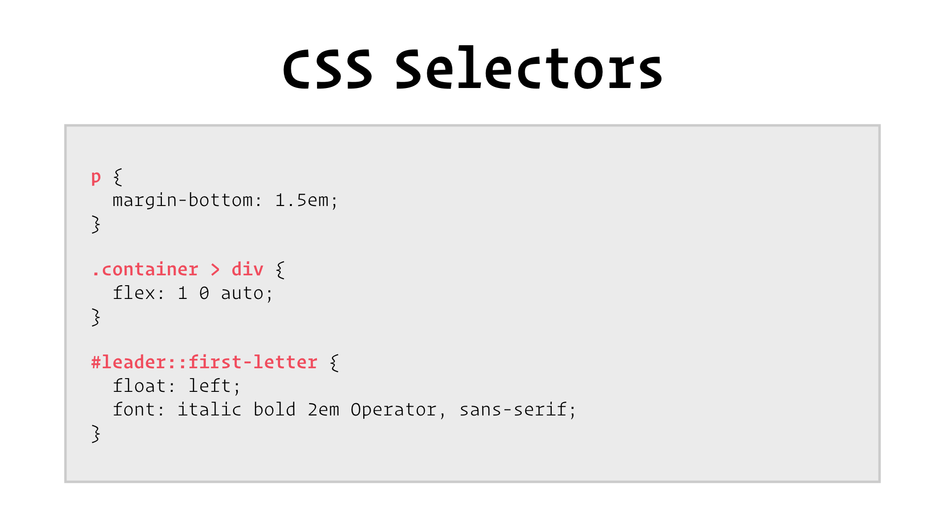
They’re the things in pink. Selectors are the part of CSS that lets us point at particular bits of a web page and say “I want to style you.”

In this talk, I’ll be covering what’s new in CSS selectors. I’ll then move swiftly along to why there’s nothing new in CSS selectors. And then we’ll finish strong with how to be MacGyver.
What’s New
Permalink to What’s New
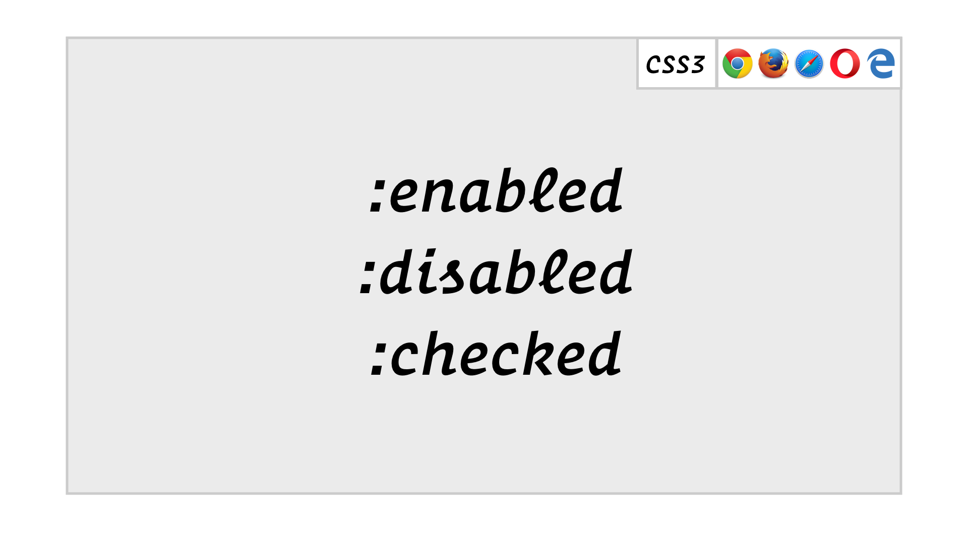
Mostly, there are a bunch of new pseudo-classes in CSS:
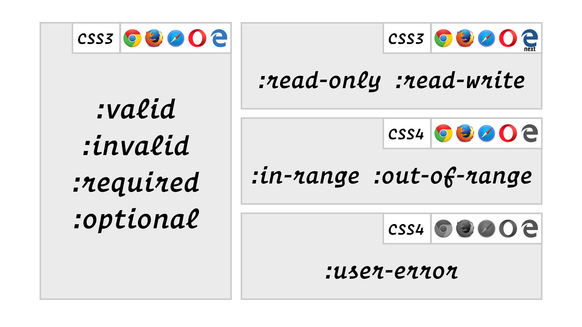
Because most form fields start off empty and therefore invalid, most of these are of limited usefulness, unless you’re happy with your forms starting mostly red. The :user-error pseudo-class has been proposed to match fields that are invalid as a result of user input, but it doesn’t have any support yet.
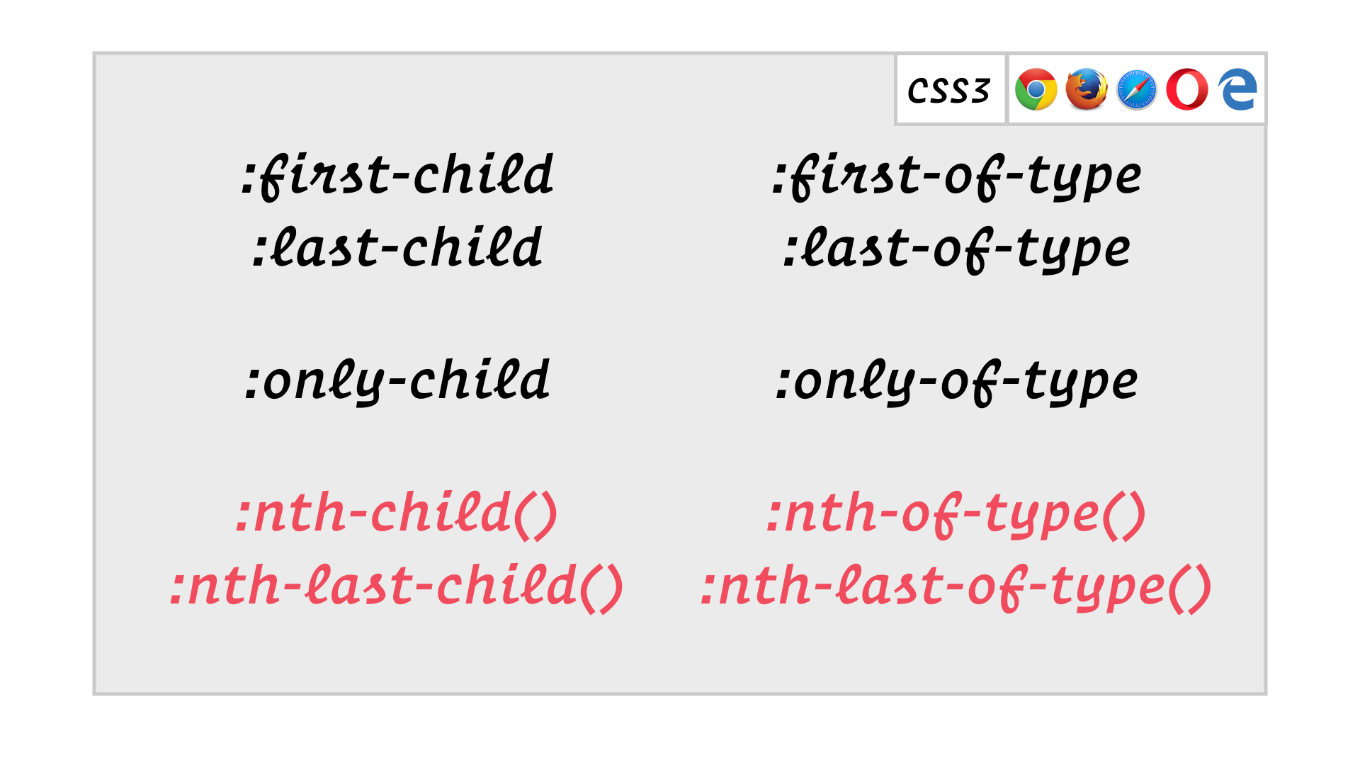
The last four are especially interesting, because they let us build really flexible selections of children:
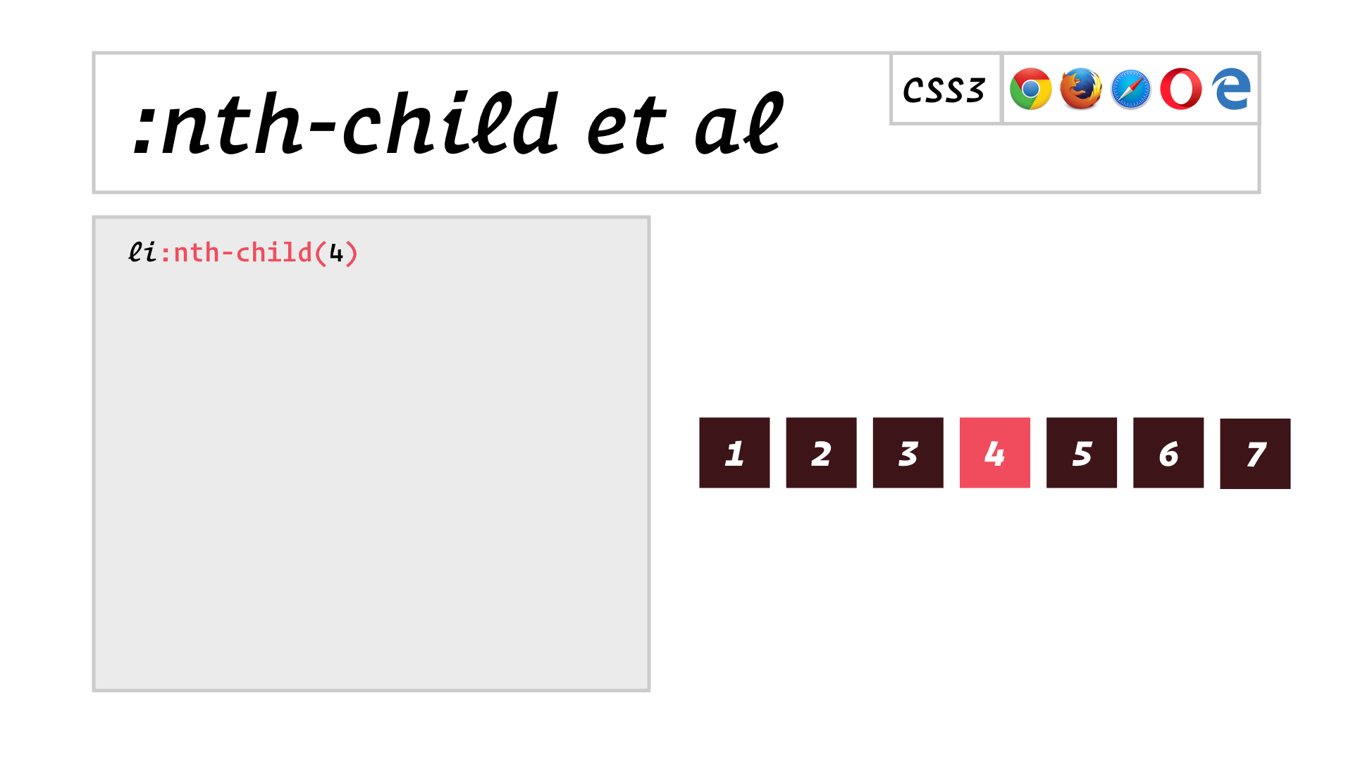
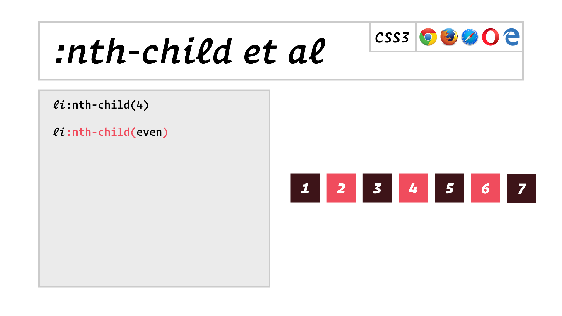
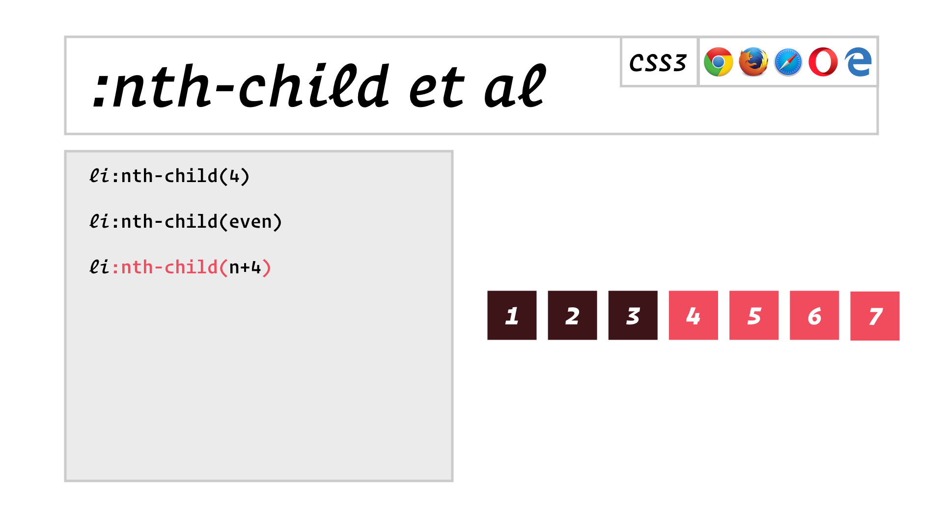
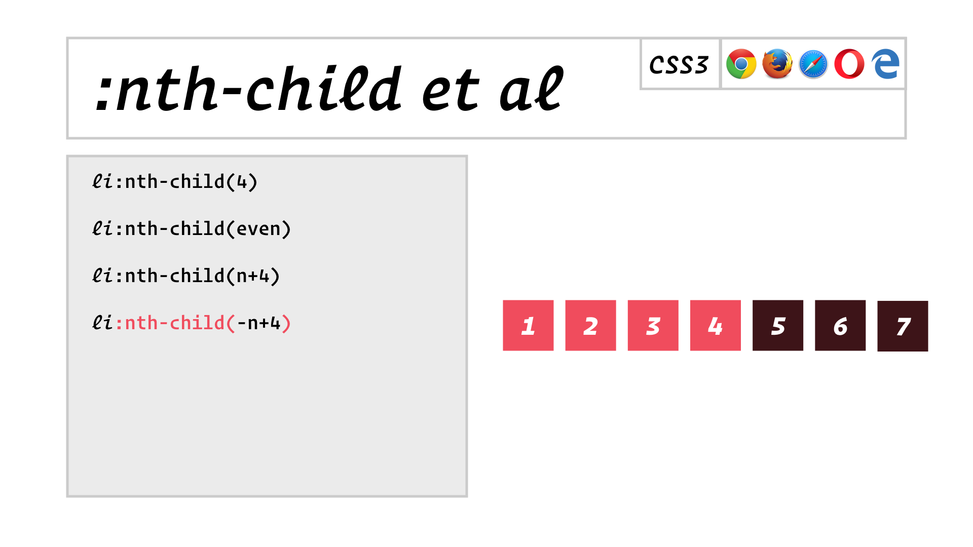
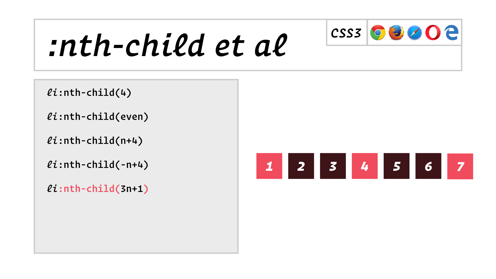
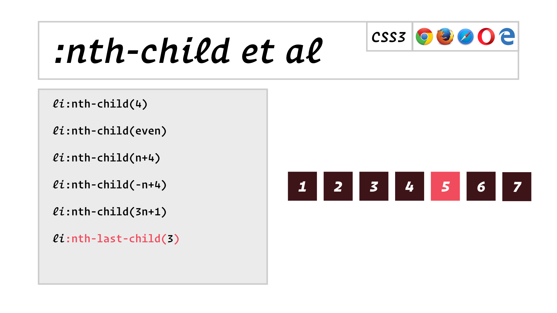
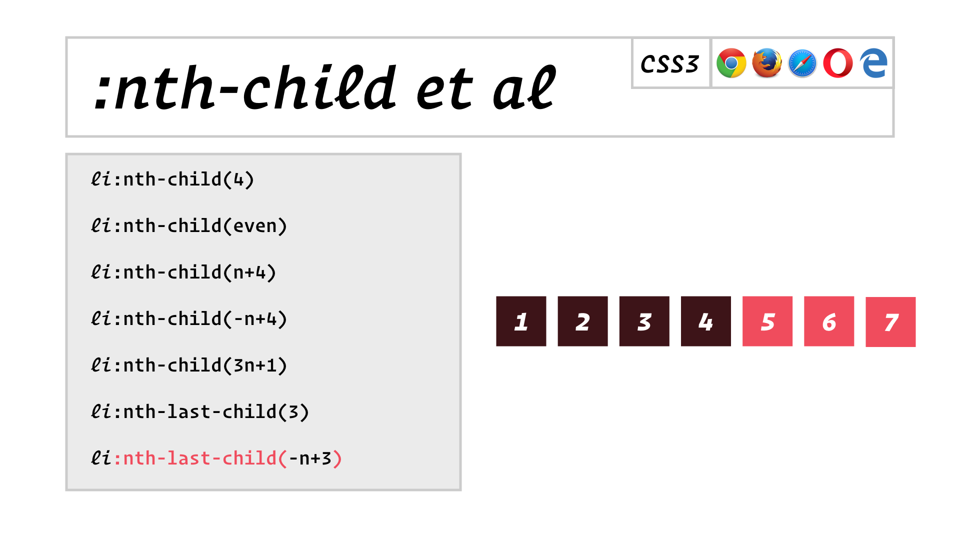
These child-selecting pseudo-classes will come in handy in some surprising ways a bit later.
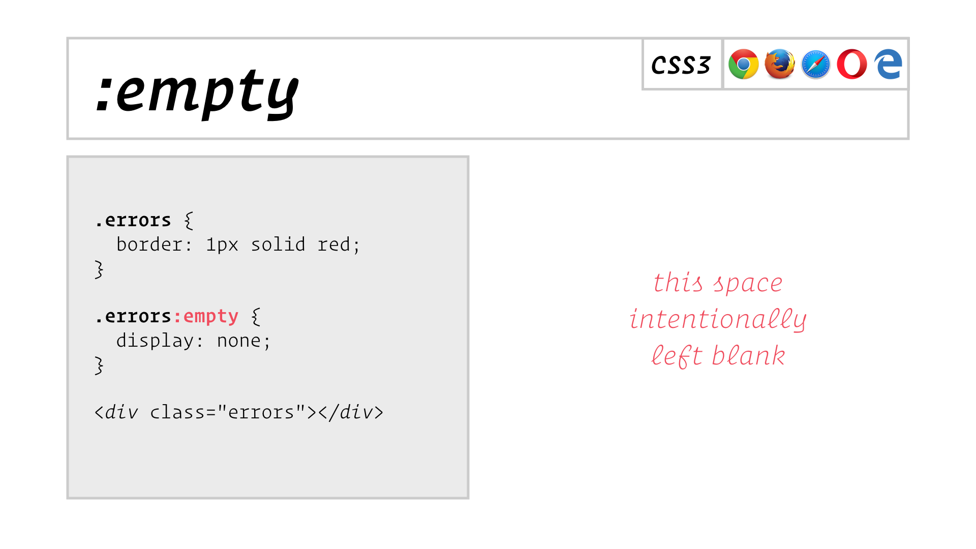
:empty can be handy if, say, your page contains a div into which your JavaScript might insert form validation errors, but if there are no errors, then you probably don’t want to display that div at all.
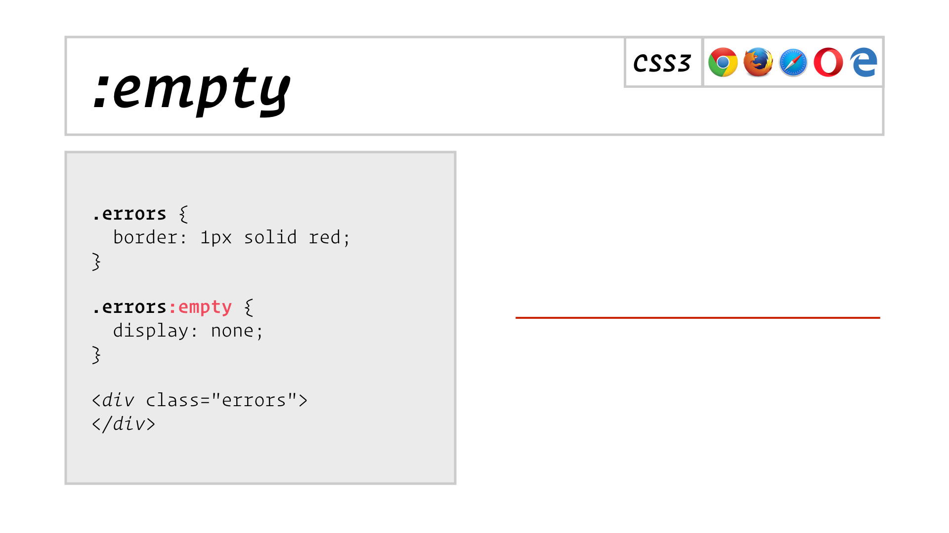
Unfortuntely, :empty won’t match an element if it contains so much as a just line break, so you really have to control the whitespace in your markup.
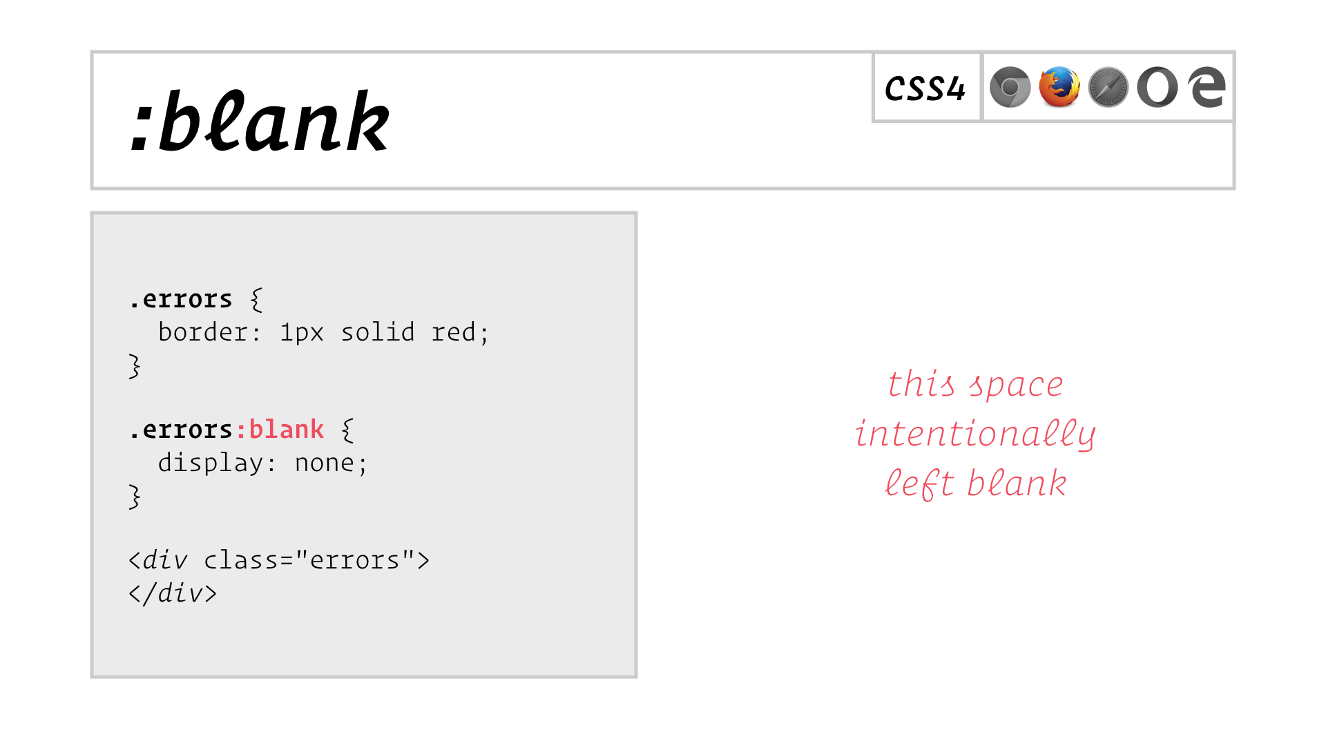
There’s basically no support for :blank yet, but it’ll be handy if it catches on.
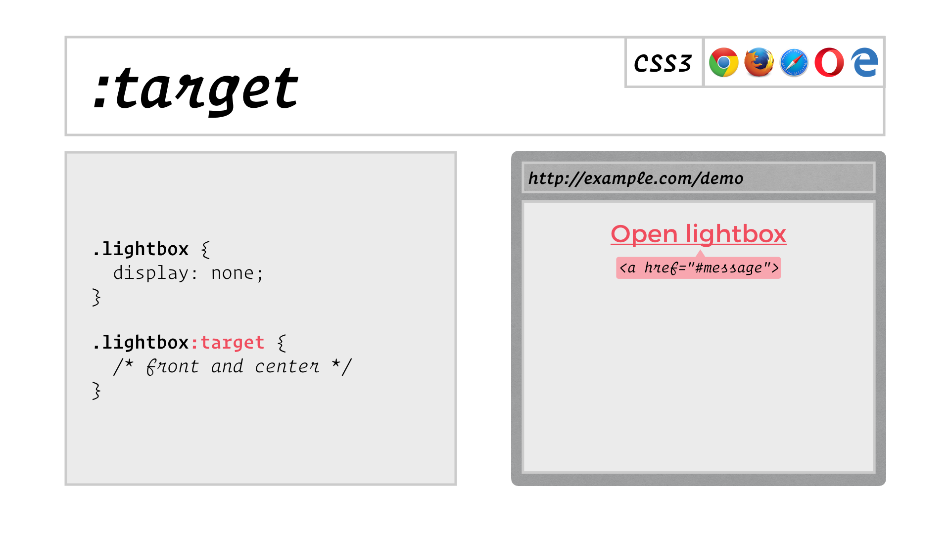
The :target pseudo-class lets you style the element whose ID appears in the fragment identifier in the URL. You can use this to do surprising things like create lightboxes without any JavaScript! Here we have a hyperlink that points to the message element in the page, which is a lightbox that’s styled hidden by default.
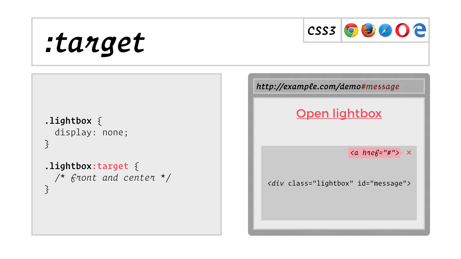
When you click the link, the URL points to the lightbox’s ID, so the :target selector matches it, and the new styles make the lightbox appear. The lightbox can also contain a link back to the empty fragment identifier, so that when you click it…
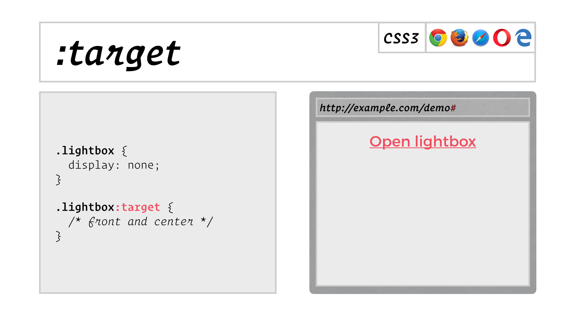
…the lightbox is hidden again. All without a shred of JavaScript!
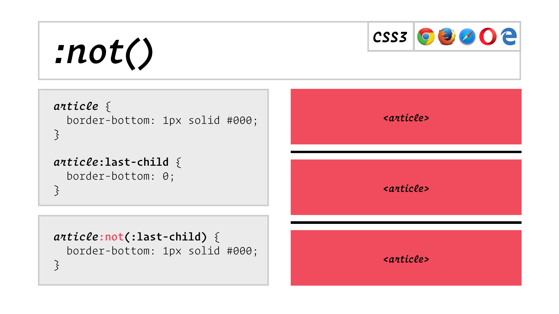
Say you want to put a border on the bottom of all but the last in a series of articles. You might think to apply the border to all articles, and then with a second rule remove the border from the last article. Instead, with a single selector using :not, you can apply the border efficiently by selecting all but the last child.
![slide: a[href]:not([class]) matches standard links only, .my_link_class can then match links with a class](/assets/images/blog/css-selectors-redux/slide.029.png)
In this example, the :not pseudo-class lets you match only links that have no class assigned. These might be hyperlinks in your body content, the ones that come out of your site’s content management system, for example. You can then use simple class selectors to style links with particular classes, and you don’t have to roll back your basic link styles because those classed links aren’t matched by the first selector.
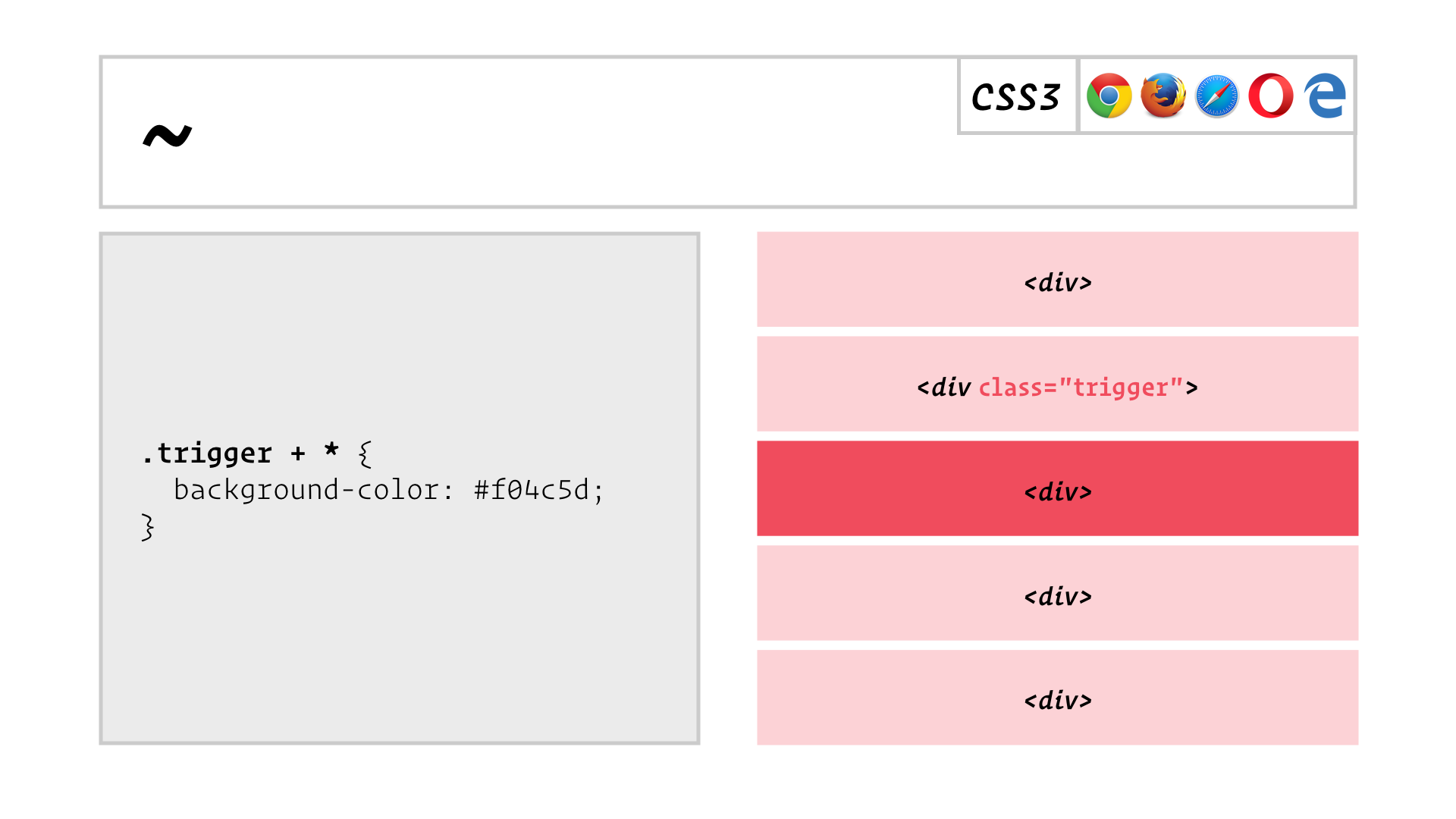
Here’s our first new selector that isn’t a pseudo-class!
Most of you are probably familiar with +, the adjacent sibling selector. It lets you write a selector to match the element immediately following another element, that shares the same parent element.
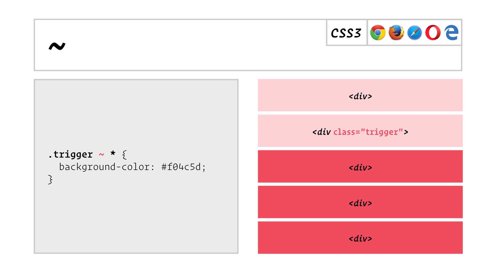
Well now we have ~, the general sibling selector. It lets you look for matches among all of an element’s following siblings.
This is another selector that has some surprising uses, as we’ll see in a bit.

Now you might be thinking all these new selectors have been around for years, and you’d be right; they have. So let’s look at some really new selectors.
![slide: [attribute=value] [attribute~=value] [attribute|=value] [attribute^=value] [attribute$=value] [attribute*=value]](/assets/images/blog/css-selectors-redux/slide.033.png)
![slide: [attribute=value i] [attribute~=value i] [attribute|=value i] [attribute^=value i] [attribute$=value i] [attribute*=value i]](/assets/images/blog/css-selectors-redux/slide.034.png)
This is boring. I honestly don’t know why you would want this, so let’s move on.
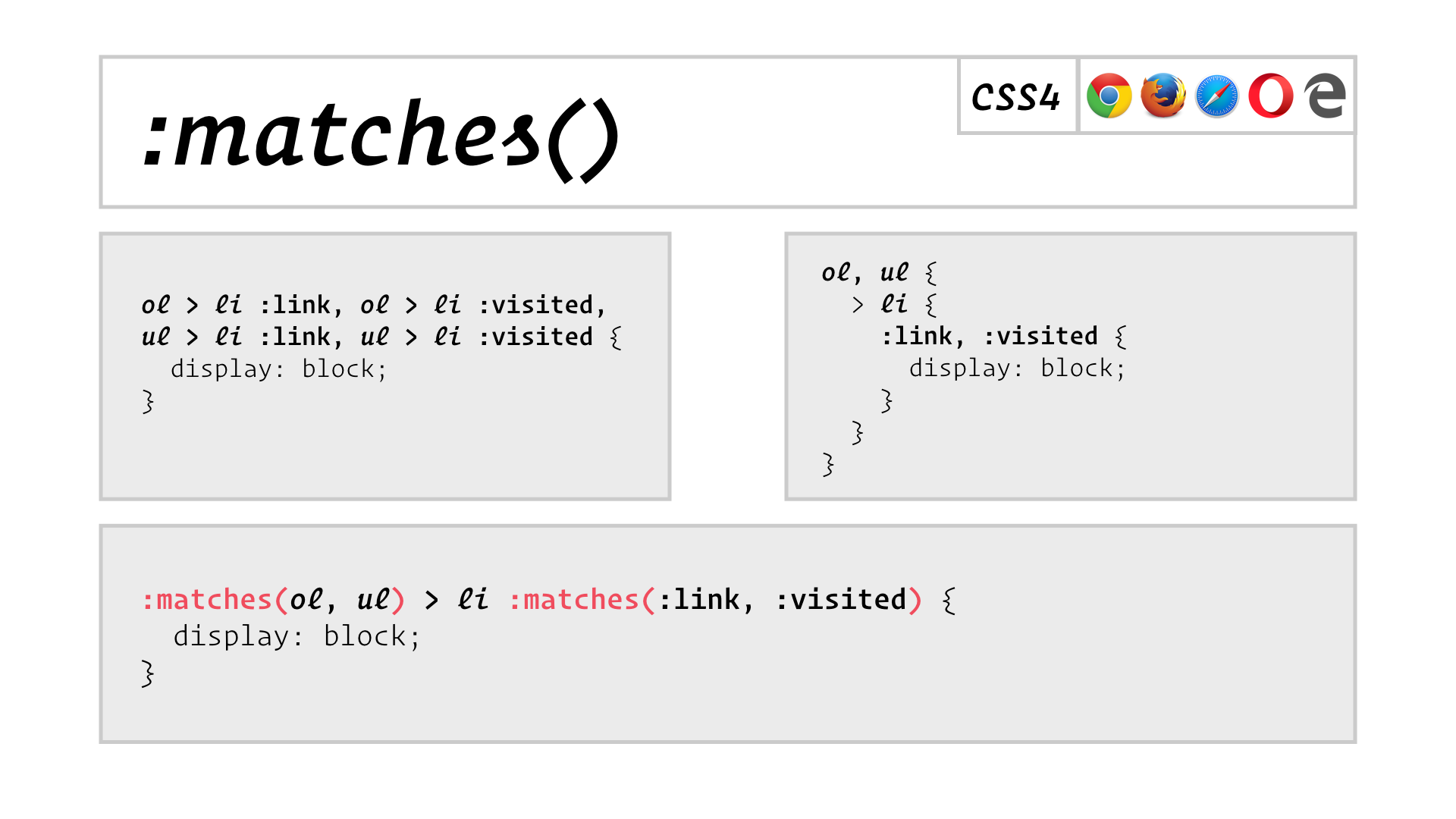
The selectors above match visited or unvisited links inside of list items, which are children of an ordered or unordered list. The first version is quite repetitive because of the alternatives. If you’re familiar with Sass, you can eliminate this repetition using nesting. But now, you can do the same thing in pure CSS using :matches.
But this is really just syntactic sugar. It doesn’t let you select any elements that you couldn’t select before. So, boring.
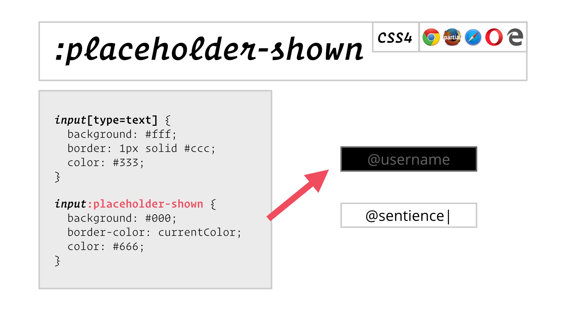
Boring!
Why There’s Nothing New
Permalink to Why There’s Nothing New
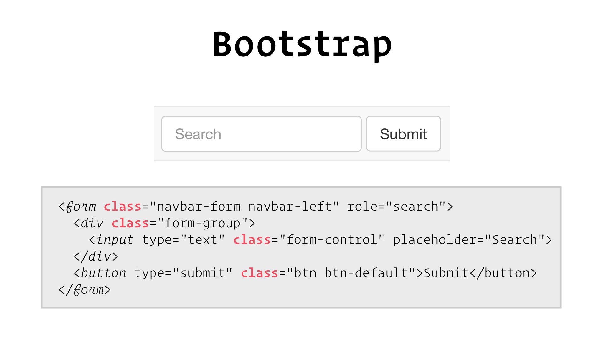
So, why are there no new CSS Selectors worth talking about? I think it’s because we’re not asking for them, because we’re all doing things like this:
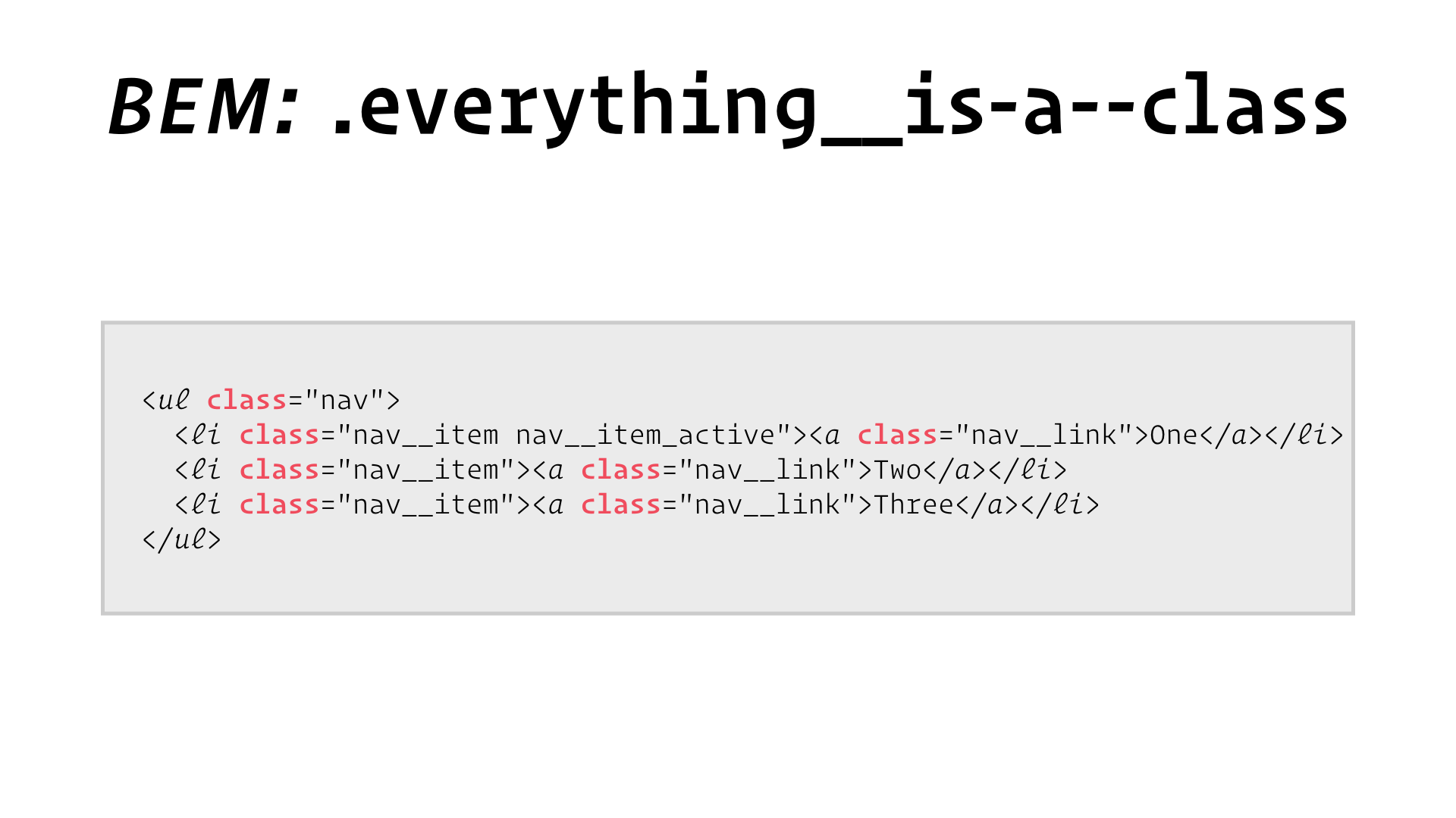
But even if you’re writing your own styles, chances are you’ve recently adopted a methodology like this one:
Even CSS Modules is just an easy way to generate unique class names:
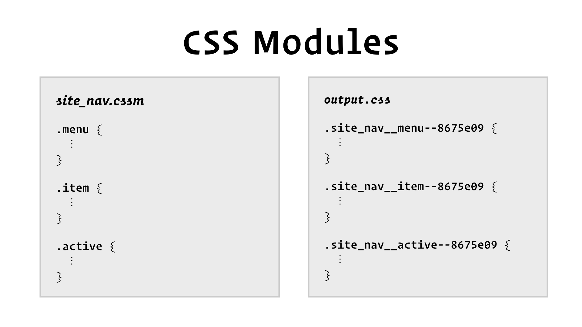
Let me be clear, we’ve adopted CSS Modules at Culture Amp and they’ve changed our game. We love them. But they really just make it easier to use class selectors.

In other words, we are no longer styling elements because of what they actually are, but because of what we have demanded they look like, using classes.
Whether or not you think this is a bad thing probably depends on whether you’re building something with the same semantics as HTML—text documents! If you’re building a GUI application that runs in the browser, it’s harder to justify sacrificing the control of classes in support of HTML semantics. You’re probably more concerned about ARIA attributes than element types.
But for better or worse, we’re turning into these people:

We show up, we want to make our page “all pretty”, so we put classes on things until we’re done. What kind of craftspeople are we if we always use the same tool for every job?
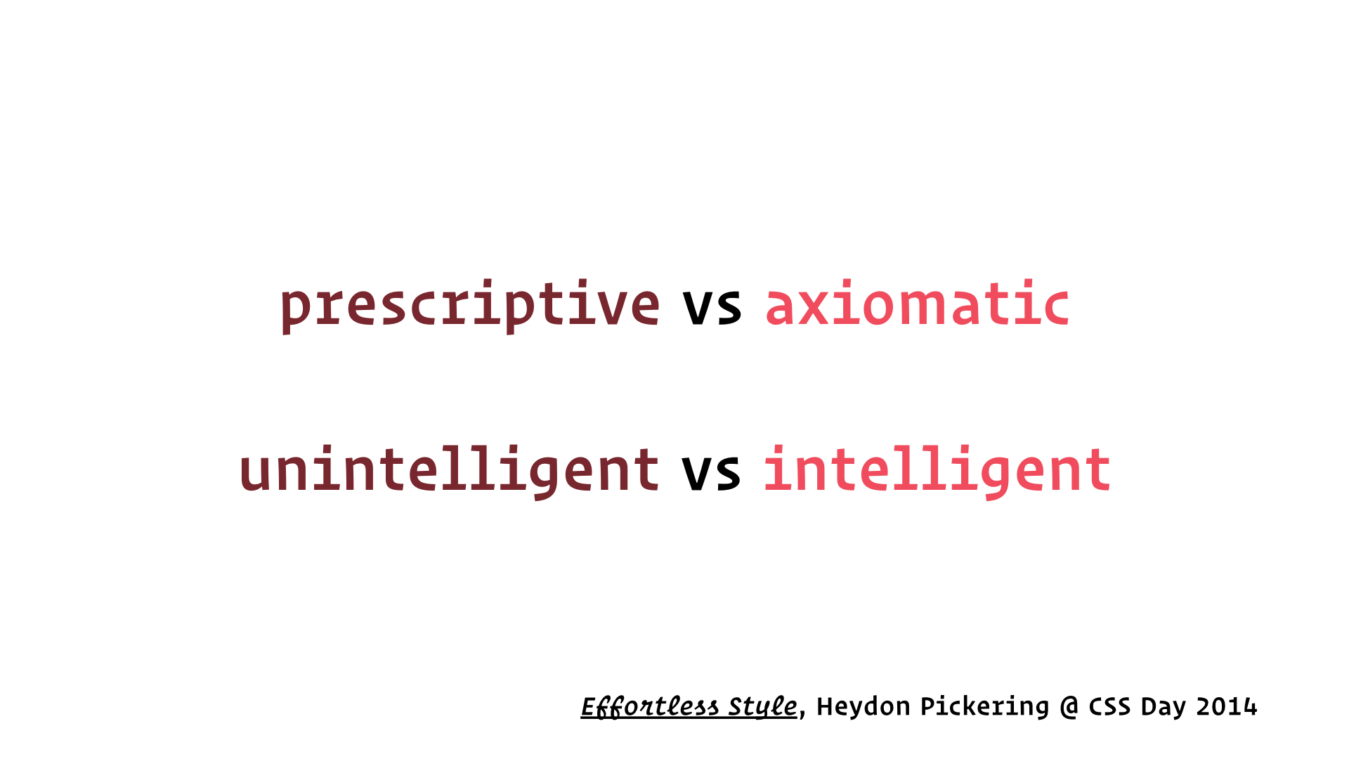
Heydon Pickering, to whom I’m indebted for several of the techniques in this talk, has proposed that we write selectors that respond to things like the relationships between elements, rather than prescribing the styles of individual elements, one at a time. These ‘axiomatic’ or intelligent styles can give rise to useful, emergent behaviour. I don’t have a lot of time to go into this, but if you’re interested please do check out his talk, Effortless Style. The video is online for free and it’s worth your time.

Let’s take a look at a couple of features in the current CSS Selectors Level 4 Working Draft:
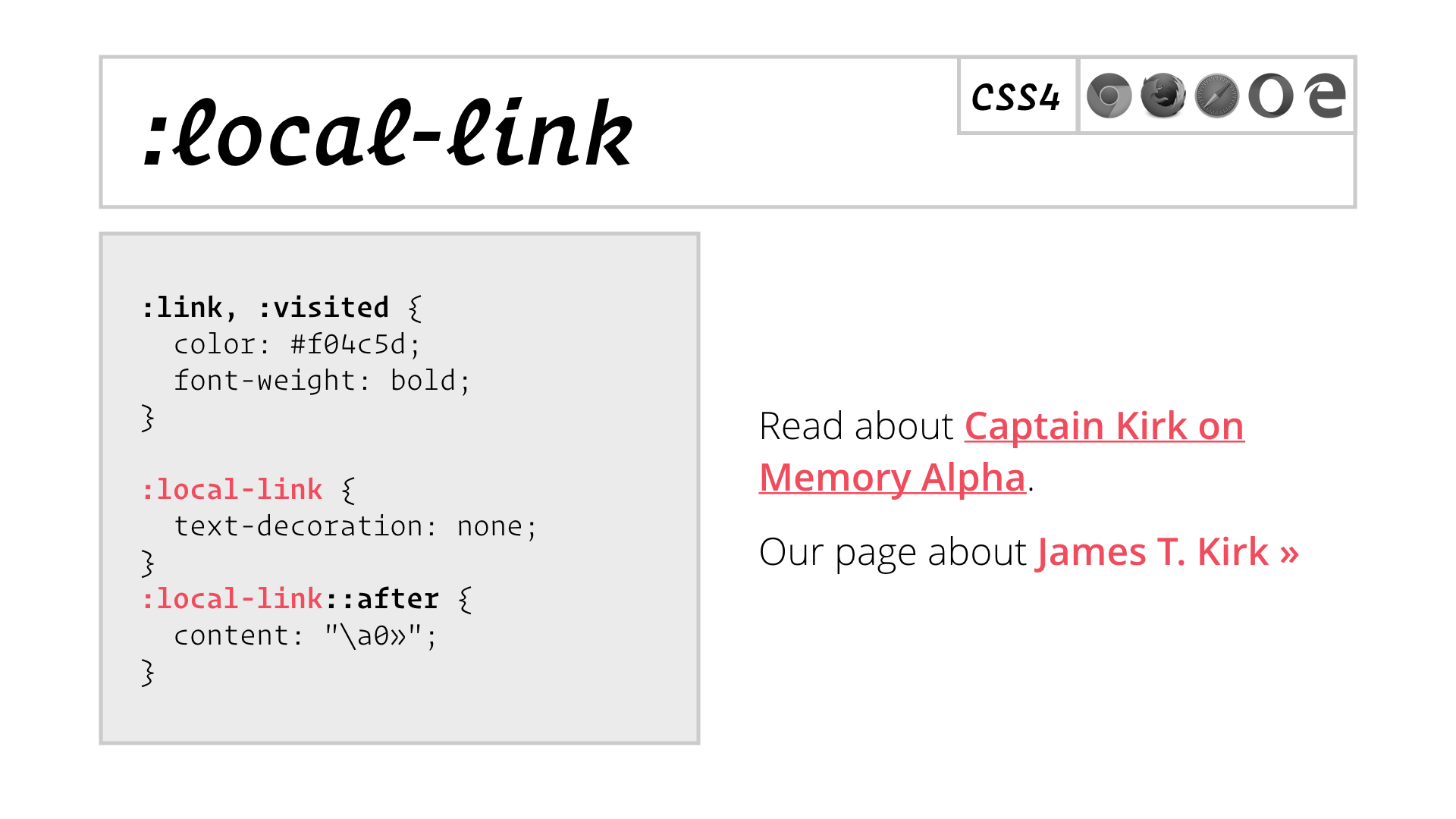
Now this would be really useful; I would totally use this! But there’s no support for it in browsers and no sign of it coming.
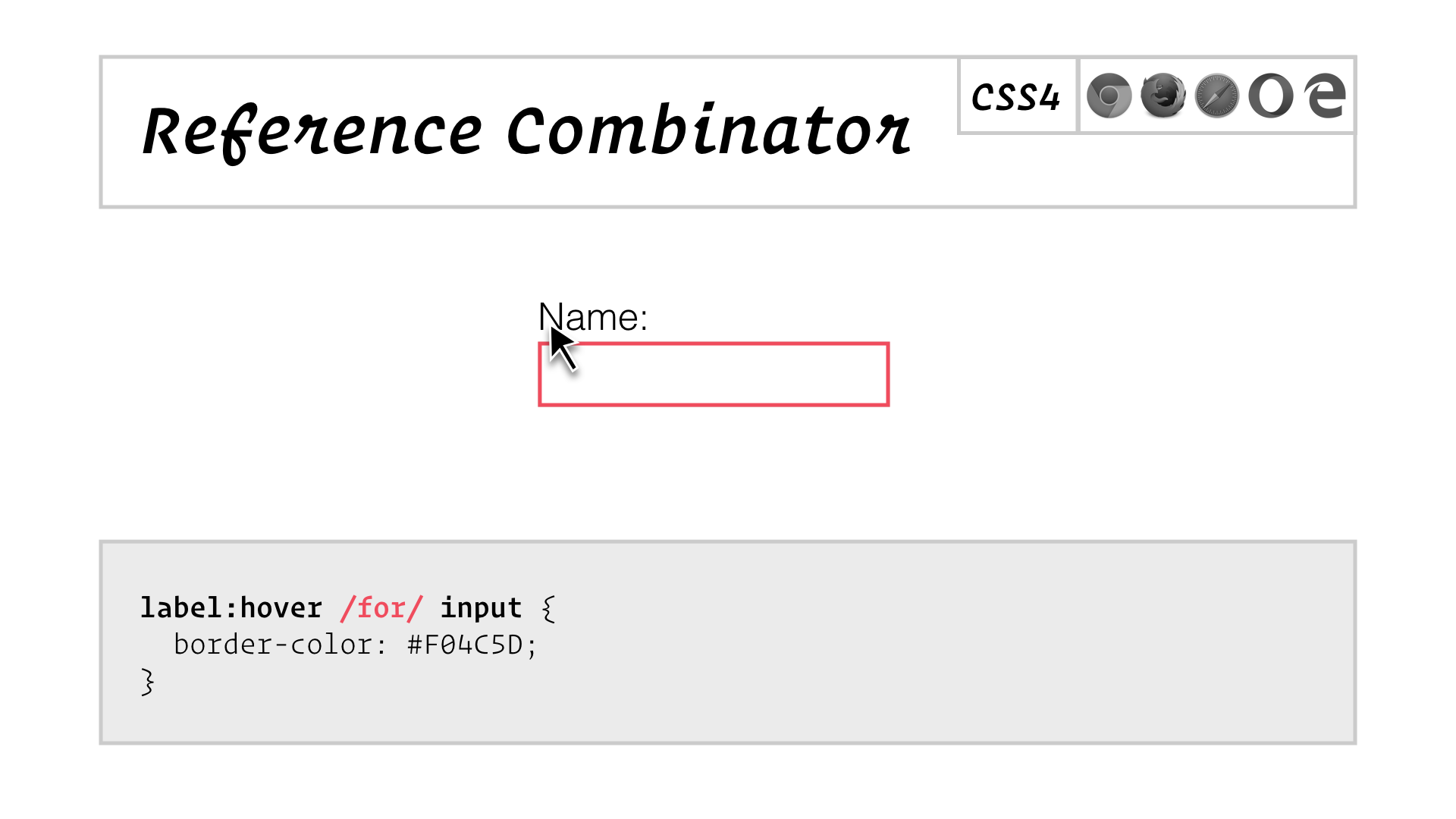
If you’ve heard of the CSS checkbox hack, well this creates all sorts possibilities for interactive styles. This would be amazing. But there’s no support for it in browsers and no sign of it coming.

That’s the ‘lack of interest’ of you, me and everyone in this room reading this.
Here’s a feature that’s still in the Editor’s Draft:
![slide: :has() Example 1: a[href]:has(> img), Example 2: section:not(:has(h1, h2, h3))](/assets/images/blog/css-selectors-redux/slide.057.png)
I’ve been wanting this for years. In the first example, a[href]:has(> img) matches any link that contains an image as its immediate child. Right now you could match that image, but if you wanted to style the link, you’d need to add a class to it.
The second example, section:not(:has(h1, h2, h3)) matches any section that does not contain any headings. It’d take a gnarly bit of template logic to get your CMS to add a class for this to the right sections automatically.
But as with many things in life, you need to read the fine print:
![slide: Dynamic profile: “…appropriate in any context, including dynamic browser CSS selector matching. Includes every selector … except for: the :has() pseudo-class” Static profile: “…appropriate for contexts which aren’t extremely performance sensitive [such as] a static document tree. For example, the querySelector() method.”](/assets/images/blog/css-selectors-redux/slide.059.png)
Elsewhere in the CSS Selectors Level 4 draft, the concept of the ‘dynamic’ and ‘static’ profiles is introduced, and unlike every other selector in the spec, the :has() pseudo-class is restricted to the static profile, which means you can only use it in JavaScript, not in your CSS stylesheets.
Browser vendors say it has to be this way, because it’s impossible to apply selectors that contain :has() dynamically, as a page is progressively rendered and then modified.
Because we’re all just settling for class selectors, there’s a voice missing from this debate: the voice of developers like us who have wanted this kind of power and flexibility for as long as we’ve been writing CSS.
In my nearly 20 years as a professional developer, I’ve lost count of the number of times I’ve told my boss something was impossible, but once I was given a push I found a way to make it happen. Browser vendors may well be right; it could be impossible to implement full support for :has() in a performant way, but I think we should give them that push.

Incidentally, this is the most depressing piece of stock photography I’ve ever paid money for, and I blame all of you for it.
Thankfully, I know someone who’s pretty good with paper clips and rubber bands.
How to be MacGyver
Permalink to How to be MacGyver
MacGyver is a TV action star from the 80s, who used science to— Well, it’s probably easier just to show you:
That’s MacGyver rescuing a hostage from a terrorist camp in a bamboo airplane built from parts he found around the tent in which they were being held.
So if all we have are paper clips and rubber bands, let’s see if we can make a couple of bamboo airplanes.

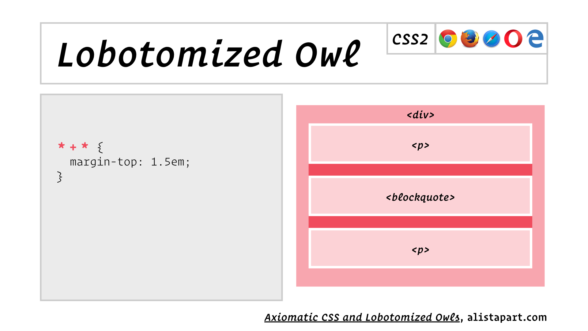
Invented by Heydon Pickering, this selector combines two universal selectors (*) with the adjacent sibling selector (+). It matches the second of any two adjacent elements, but by applying a top margin, which only affects block elements, you’re only styling adjacent blocks.
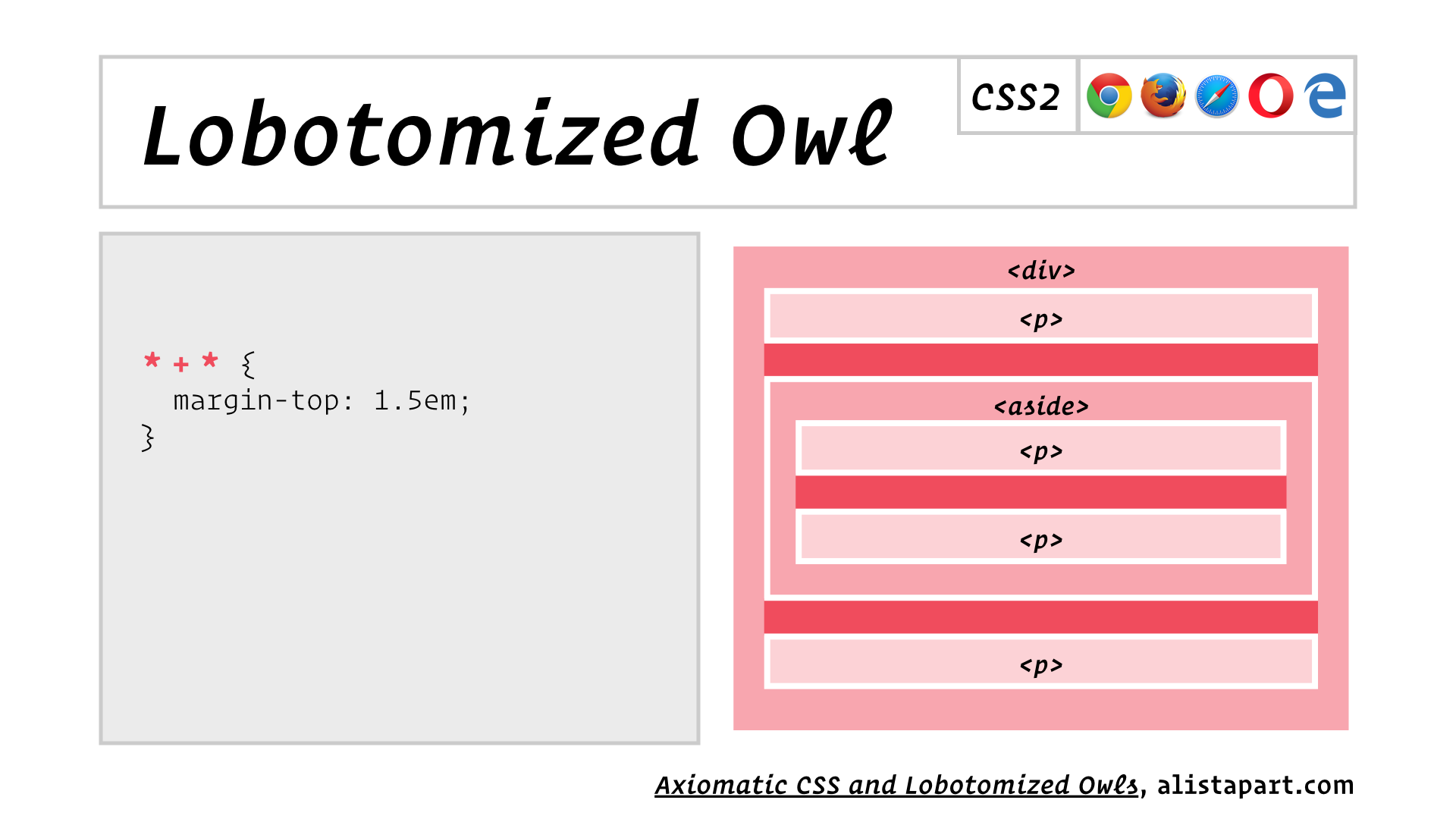
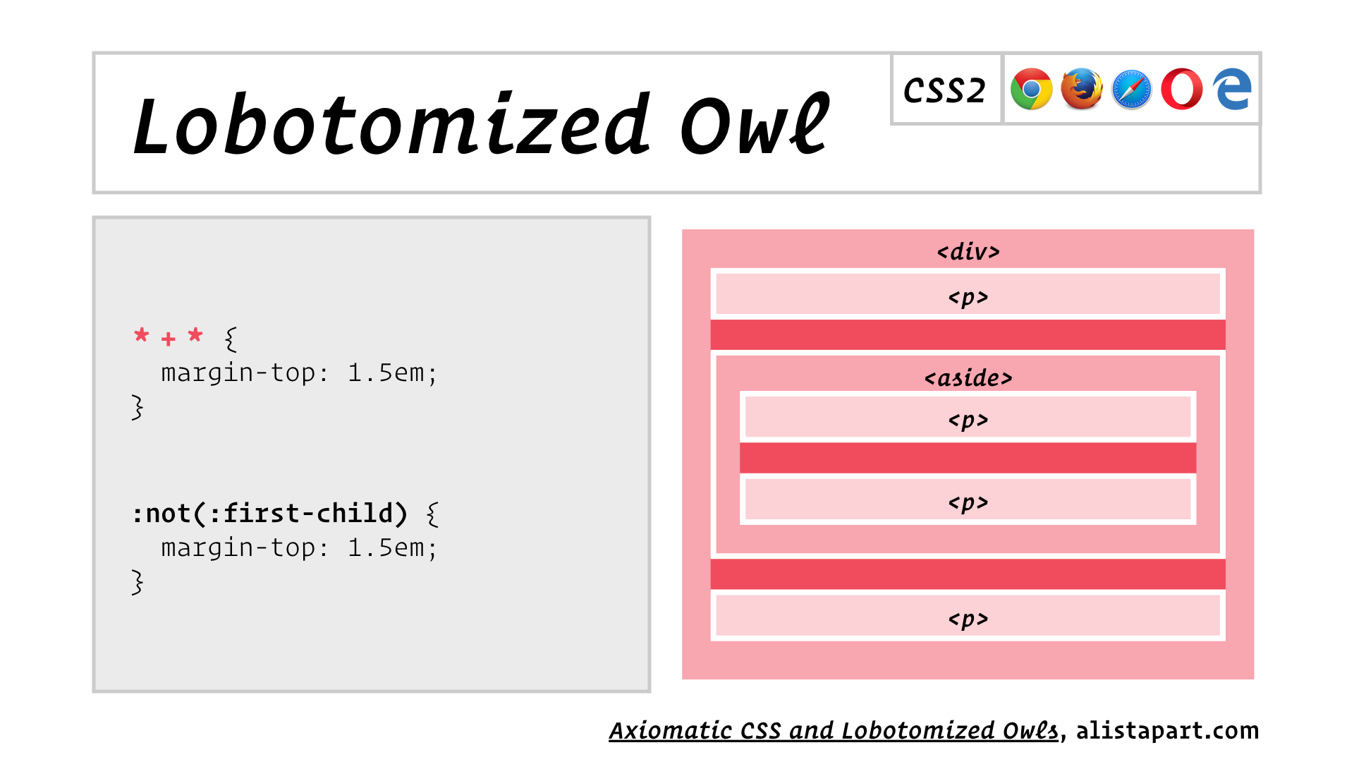
If you know your selectors, you might be thinking that * + * could be more clearly written as :not(:first-child). Well, I’d tell you that you were almost right. First, it would need to be :not(:first-child):not(:root) so that it didn’t match the body element.
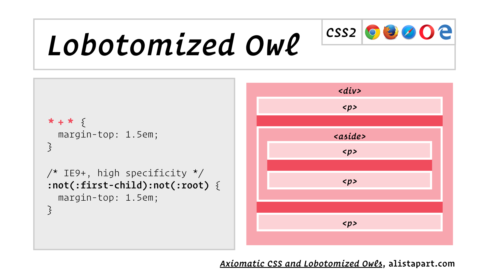
With two pseudo-class selectors in this alternative form, you’d have a selector with relatively high specificty, that was difficult to override with other selectors. * + *, on the other hand, has a specificity of zero. Any selector will override it!
For example:
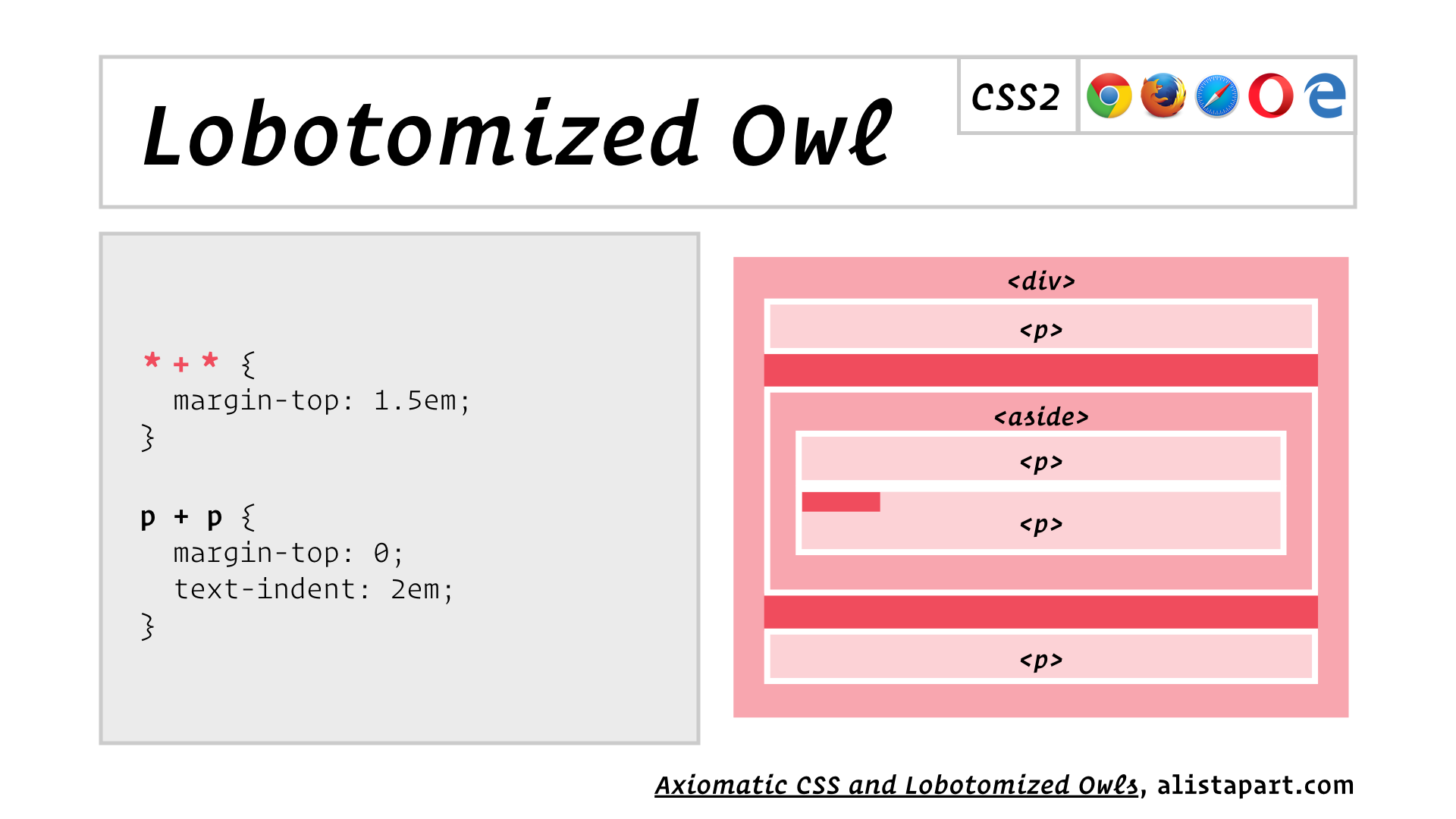
Isn’t that cool?
Here’s another bamboo airplane, also thanks to Heydon Pickering.

Since I’m presenting this at Respond, I don’t need to tell you what media queries are. They let you apply different styles depending on the size of the device’s viewport.
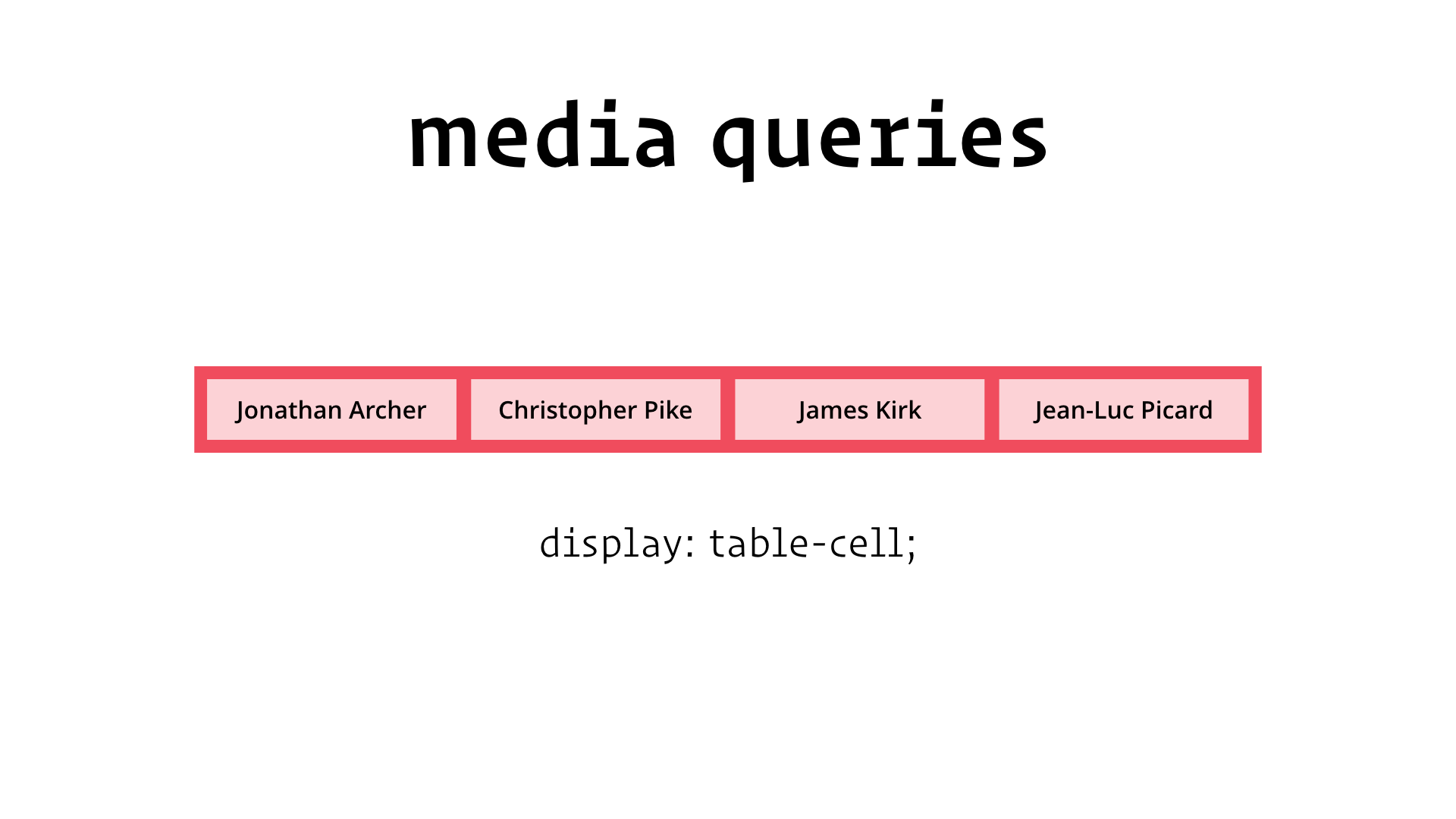
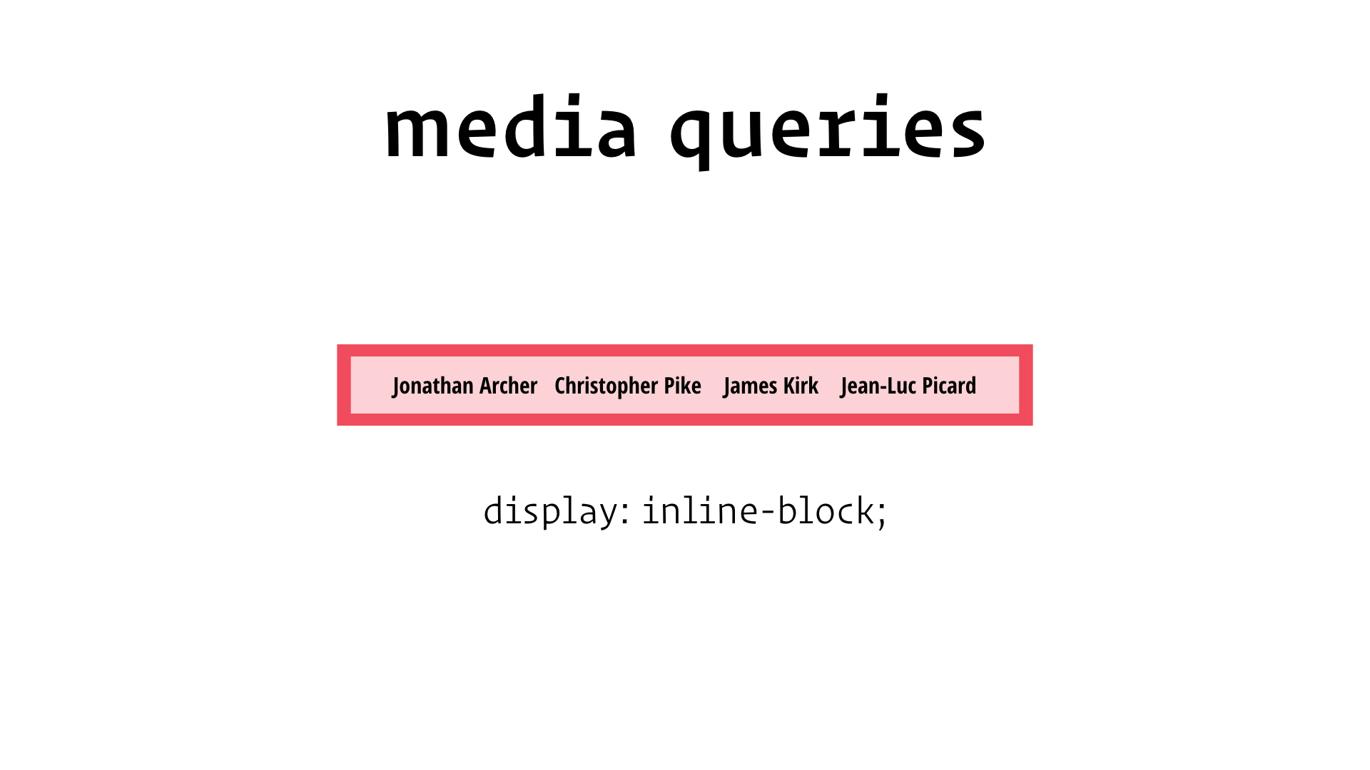

But what if we could write styles that responded to the content of the page the same way media queries let us respond to the size of the browser window?
Let’s say we have the same nav bar.
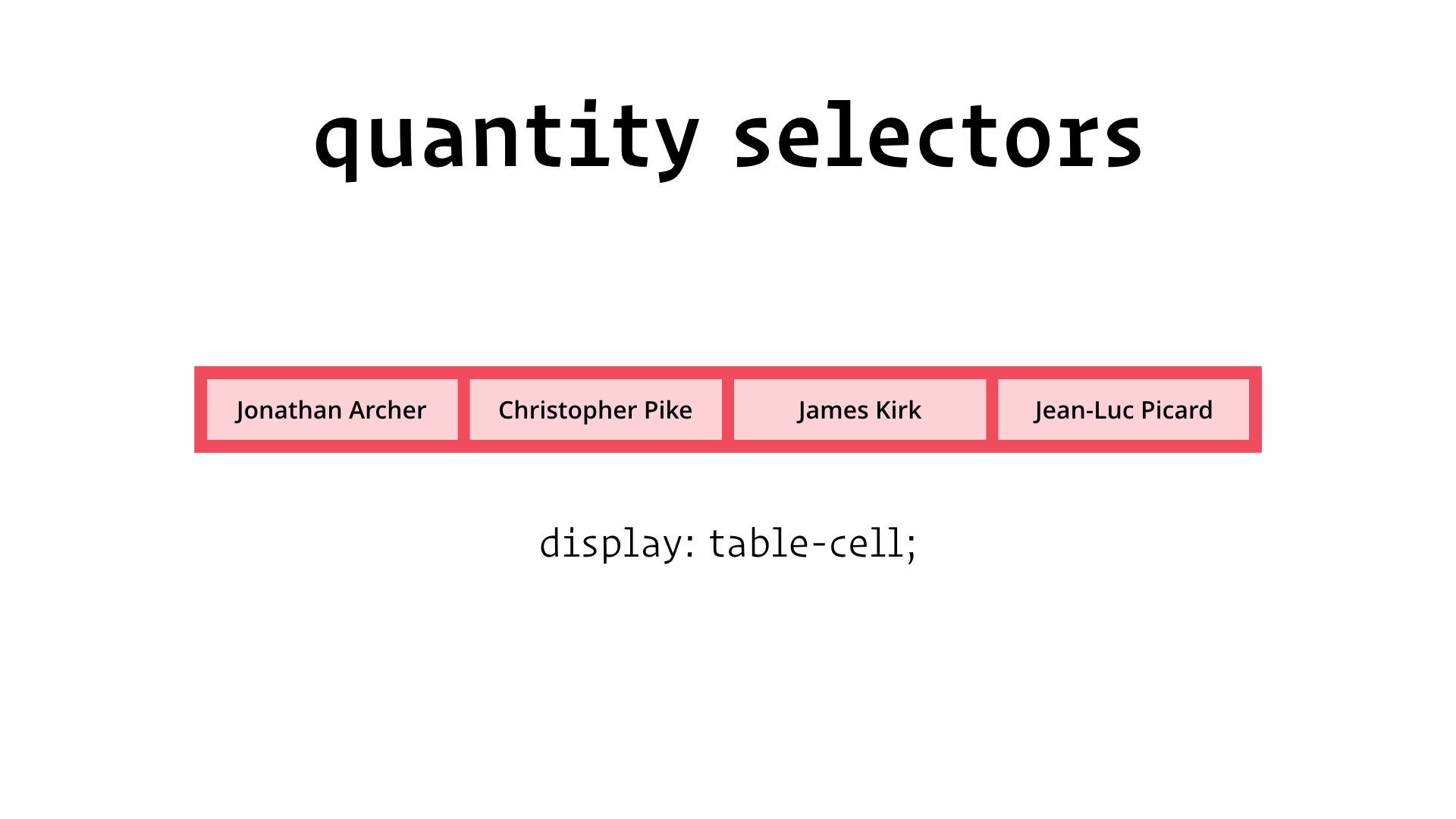
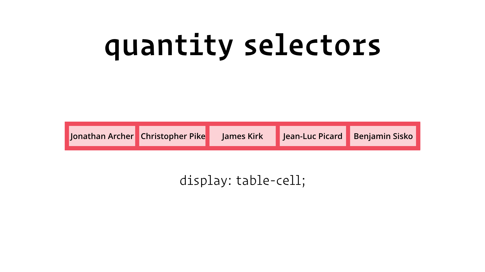
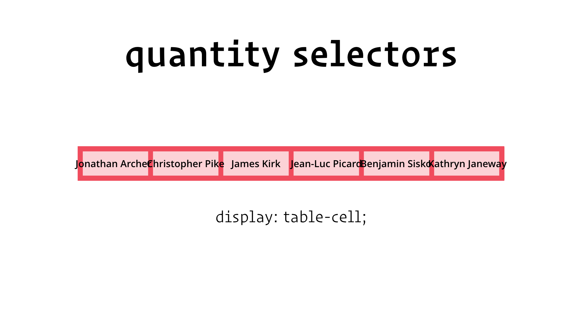
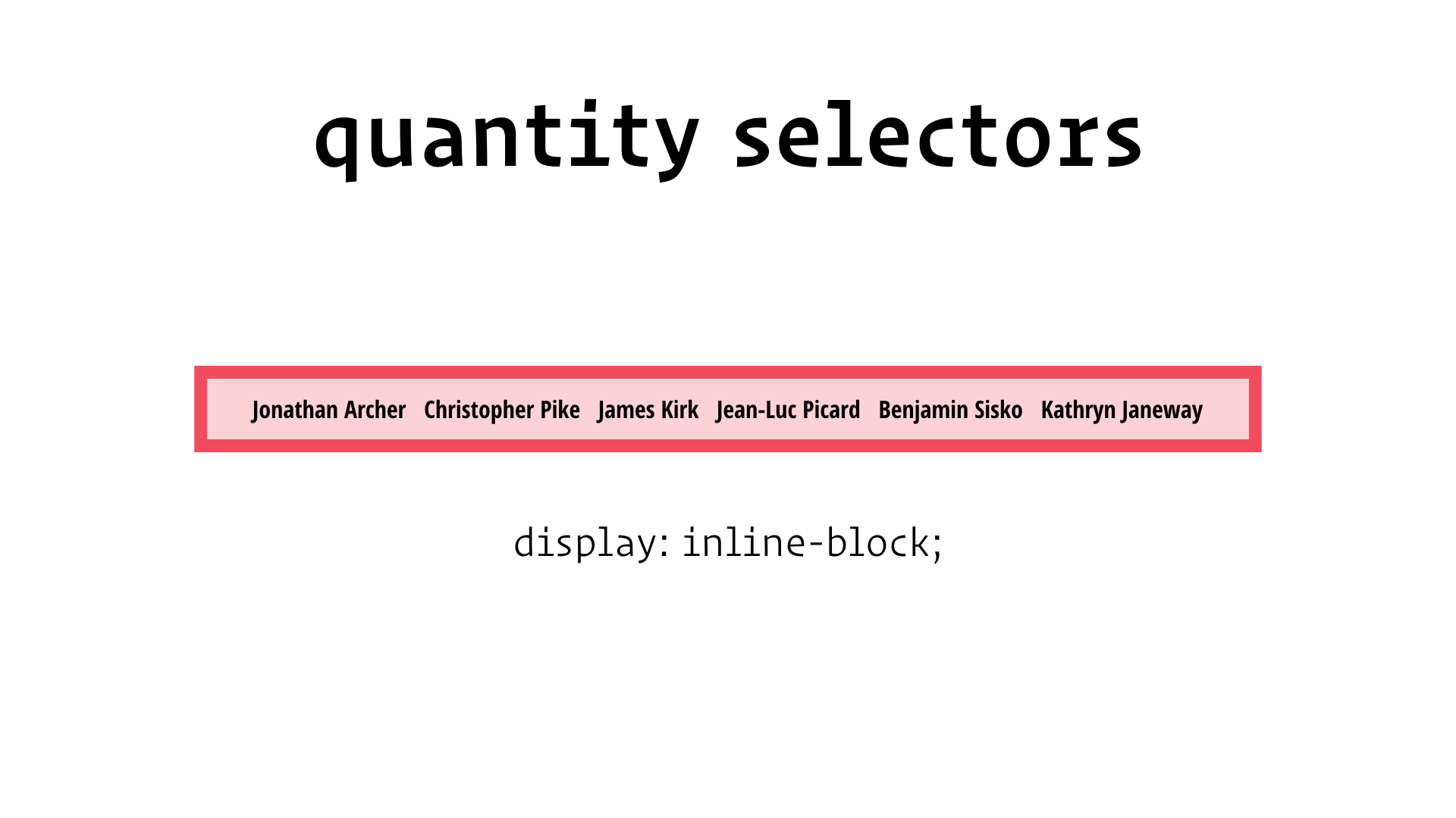
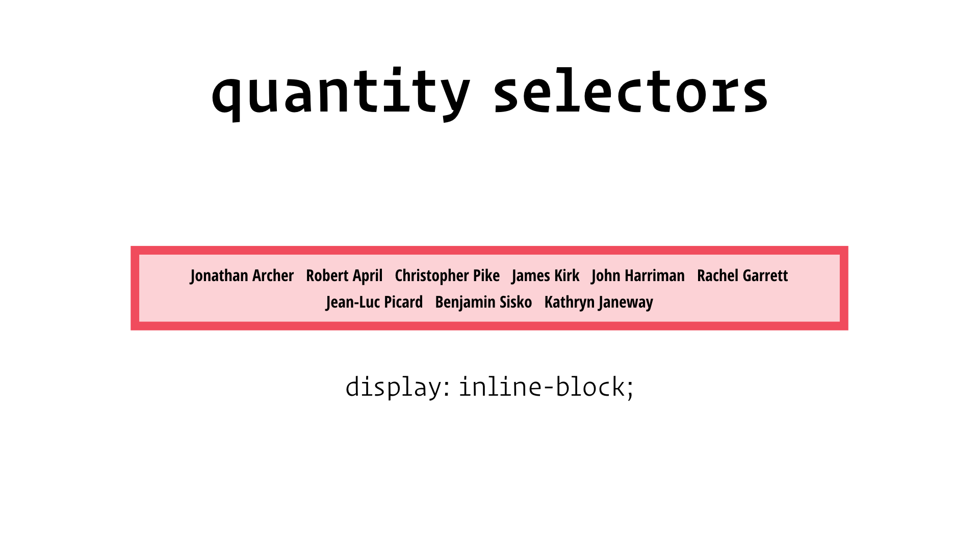
So, what do you think? Can we do this?
Let’s start simple:
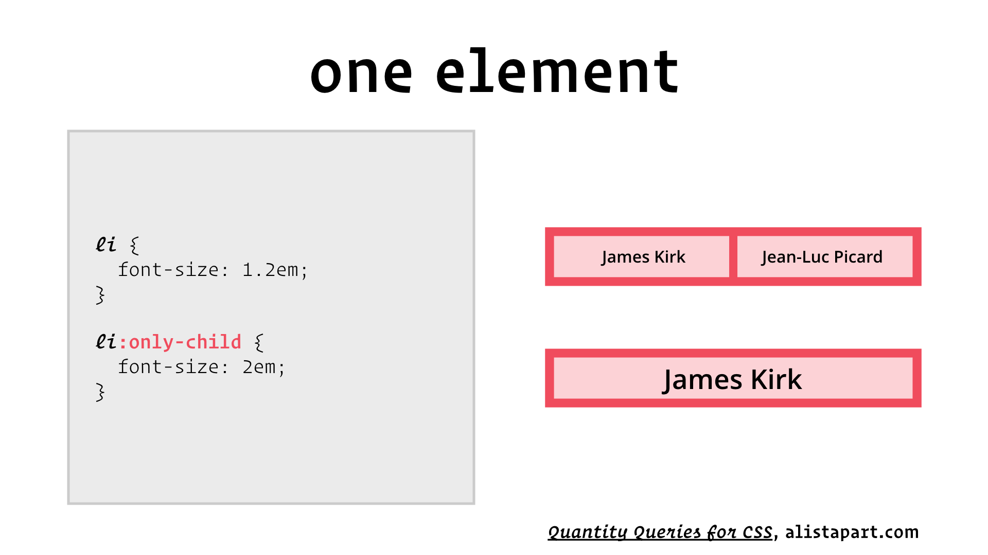
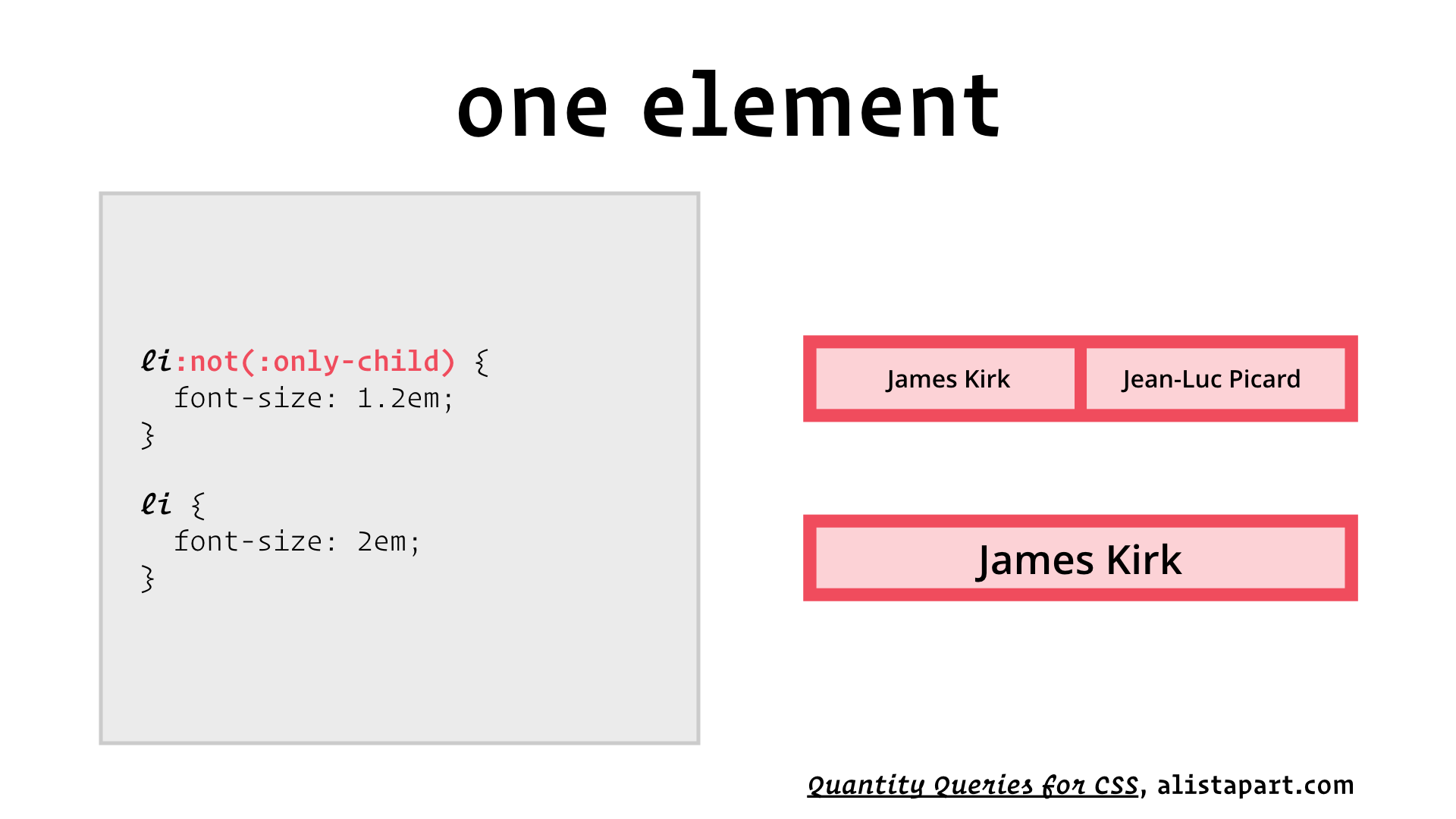
Okay, that was too easy. Let’s try a bigger challenge:
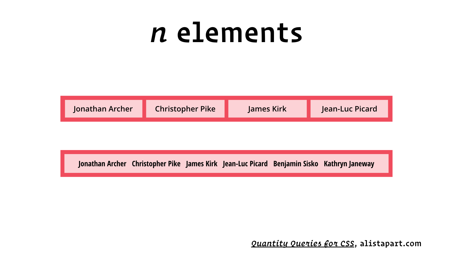
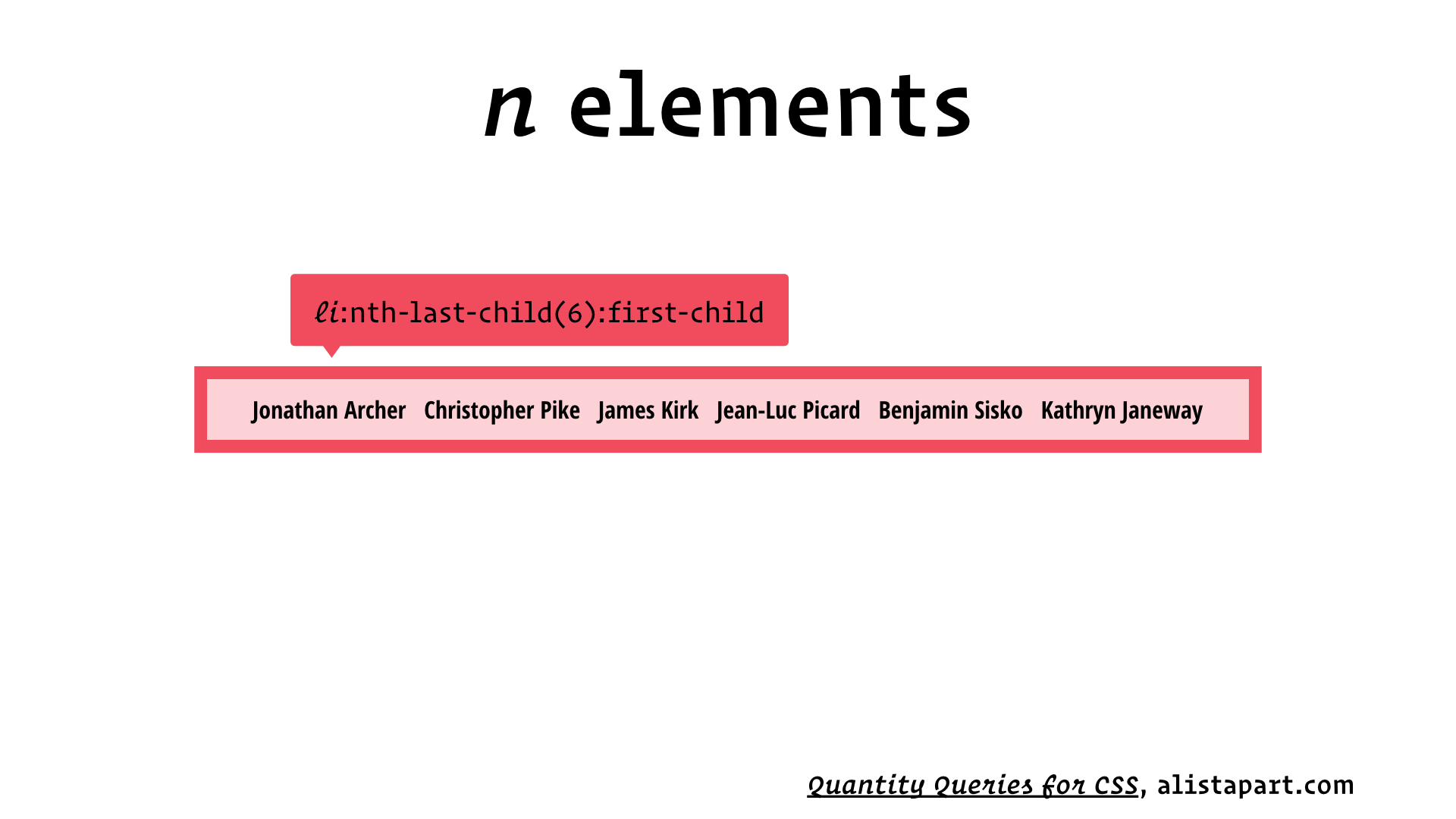
:nth-last-child(6) matches the sixth-to-last child, and :first-child matches the first child. For one element to be both the sixth-to-last child and the first child, there must be exactly six children!
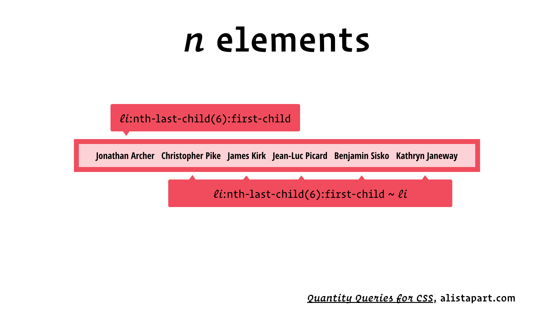
Earlier we saw ~, the general sibling selector, which matches all of the following siblings of a given element. Since we’ve already got a selector to match the first child, we can use this to write this second selector that matches the remaining five children, but again, only if there are exactly six children.
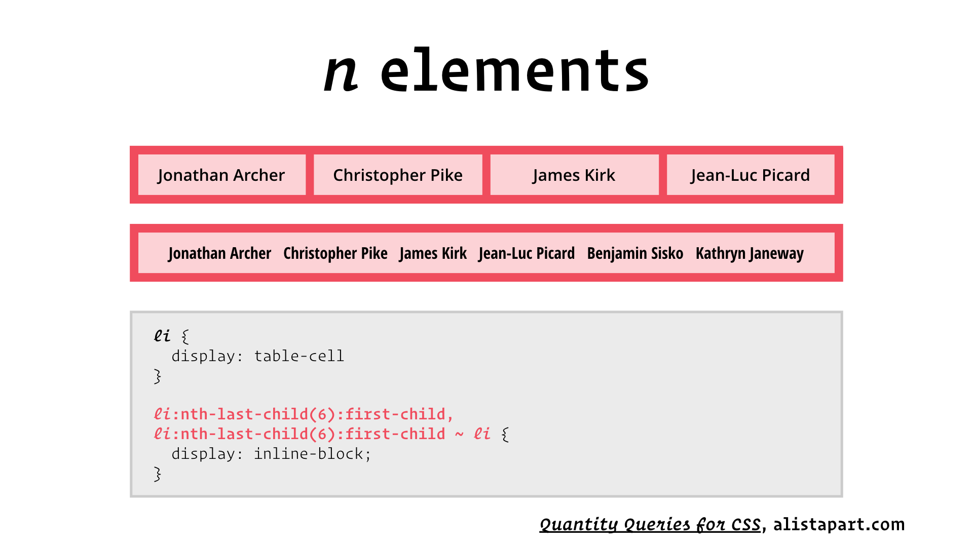
Not bad! But the challenge before us is to write a selector that matches n or more children.
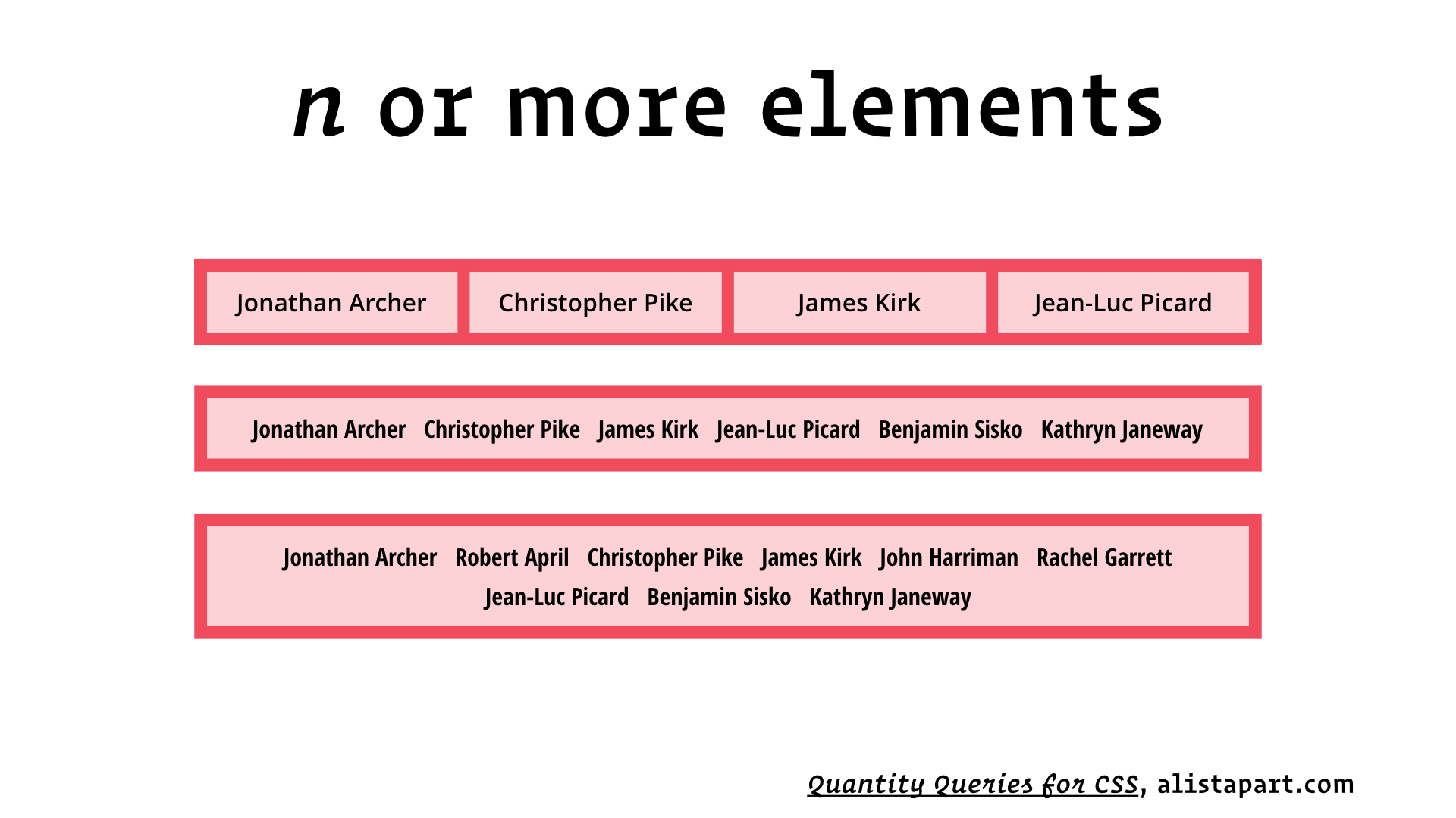
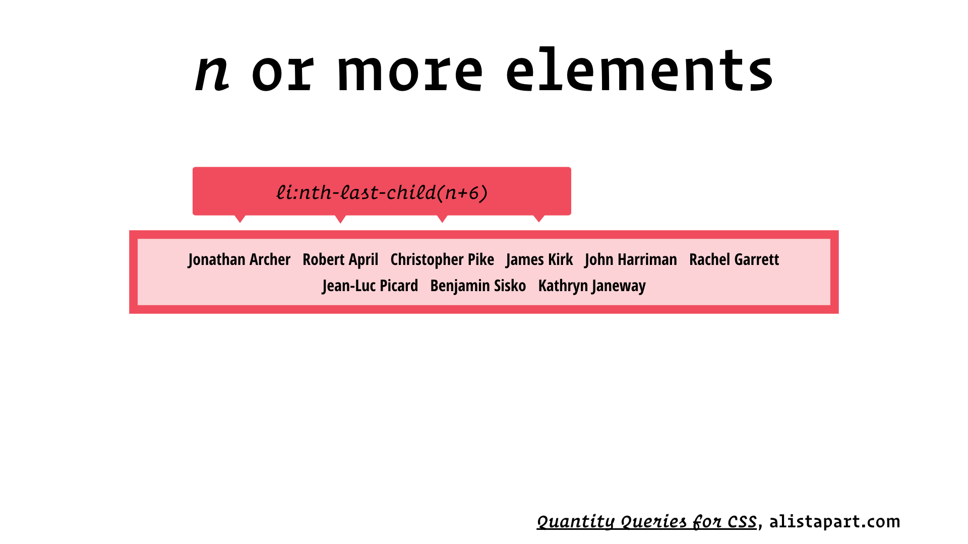
If there are fewer than six children, this selector won’t match anything. So now that we’ve matched the first several, all we need is a selector to match the remaining five children. And I just showed you how to do that!
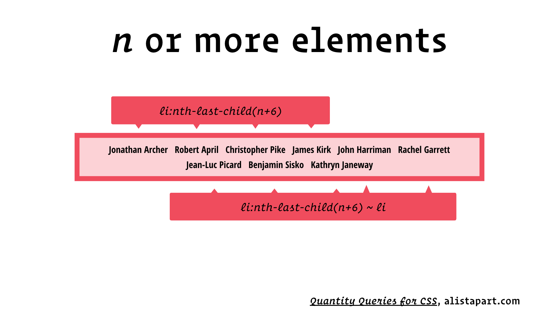
And there you have it:
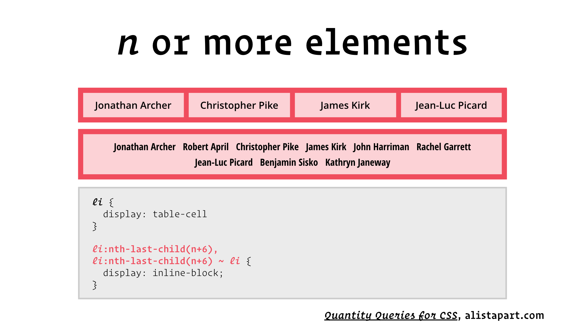
These two selectors combined will match all of the children, but only if there are six or more of them!
We can also invert the logic, and write a selector that matches all of the children, but only if there are n or fewer of them:
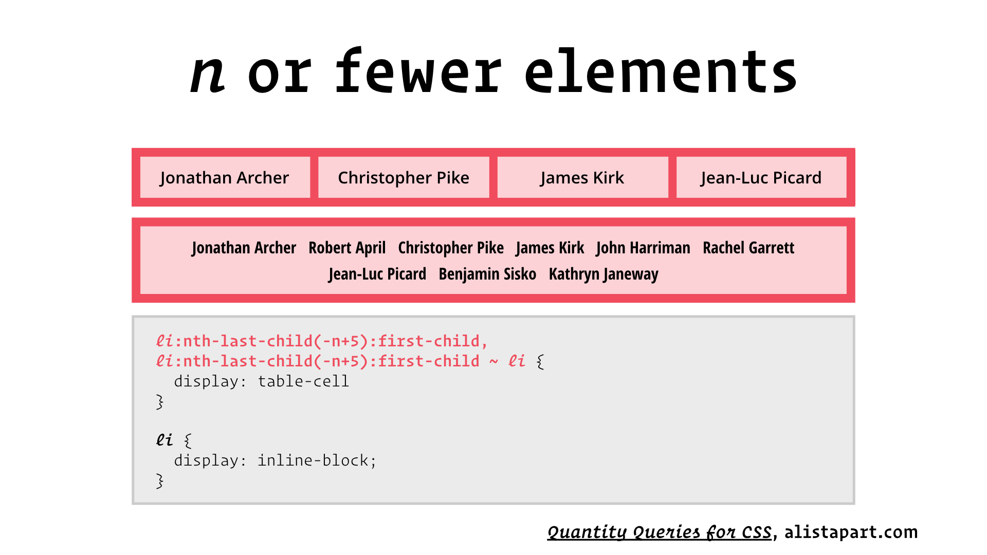
There we go: the Lobotomized Owl and Quantity Selectors. Two bamboo airplanes assembled from parts we found lying around.
I hope I’ve rekindled your interest in CSS Selectors, and encouraged you to get out there and demand the powerful selectors we need.
